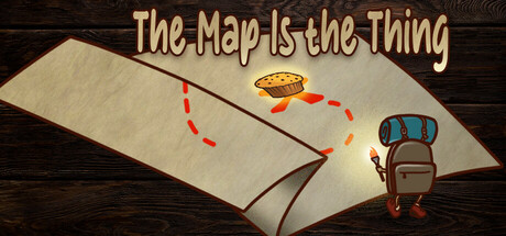
The Map Is The Thing scores 68/100 — better than 18% of Casual capsules (n=10,153).

Quick text summary

The Map Is The Thing scored 68/100 on Steam Analyzer — Solid for a Casual capsule. Top priority fix: [uniqueness_polish] Redesign the visual approach to show the map-folding mechanic in action (partially folded or layered maps) to differentiate the core game concept and create visual distinctiveness.

Capsule scores by dimension

  • Genre Clarity: 7/10 — Puzzle mechanic clear, casual tone evident. The visual setup with an unfolded map, key icon, and backpack clearly signals a puzzle-exploration game. The tagline 'The Map Is the Thing' reinforces the core mechanic at full size. At tiny size, the map and key remain readable as puzzle elements, though the specific 'map folding' innovation becomes abstract and could read as generic exploration puzzle.
  • Title Readability: 7/10 — Readable at full, loses clarity at tiny. The title uses a warm tan/beige serif font with clean spacing against dark wood background, providing good contrast at full header size. At small and tiny sizes, the font remains mostly legible but becomes compressed and the decorative serif details blur slightly, reducing immediate impact during quick scroll. The tagline positioning below adds context but competes for attention in the hierarchy.
  • Contrast & Color: 8/10 — Strong warm gold against dark wood. The warm tan/gold title text and beige map pop clearly against the dark wood texture background, creating solid value separation. The blue backpack and red dashed line add saturated accent colors that guide the eye without overwhelming. Even in grayscale, the title maintains clear legibility and the map-backpack composition separates well from background, supporting strong tiny-size readability.
  • Uniqueness & Polish: 6/10 — Competent craft, conceptually generic presentation. The capsule demonstrates clean execution with intentional typography and a cohesive warm color palette, but the visual presentation reads as a straightforward scene composition rather than a distinctive stylistic hook. The folded map concept is communicated functionally but without memorable art direction or visual storytelling that sets it apart from other casual indie puzzlers. Compared to top performers like DAVE THE DIVER or Tiny Glade that establish iconic visual identity immediately, this feels competent but underdifferentiated.
  • Brand Consistency: 6/10 — Functional but no iconic identity markers. The capsule uses a consistent warm earth-tone palette (tan, gold, brown wood) that aligns with the dungeon-exploration theme, but lacks memorable visual identity cues or signature motifs. The backpack and key are generic symbols without distinctive styling that would create recognition across multiple touchpoints. The serif typography is stable across the image, but without a unique character or symbol to anchor brand identity.
  • Composition: 7/10 — Clear focal point, logical spatial hierarchy. The unfolded map dominates the left-center composition as the primary focal point, with the backpack and key positioned as supporting secondary elements on the right. The layout creates natural left-to-right reading flow and depth through layering (flat map, elevated backpack, red path line). At tiny size, the composition remains readable with the map and backpack clearly distinguishable, though the red dashed line becomes harder to parse at extreme reduction.

What works

  • Warm color contrast against dark background. The tan and gold palette separates cleanly from the dark wood, maintaining strong readability even at small sizes and supporting quick visual recognition during scrolling.
  • Clear spatial composition and focal hierarchy. The map anchors attention as the primary element, with backpack and key positioned logically to guide the eye and establish the core mechanic without clutter.
  • Functional genre communication. The map, key, and dungeon-explorer visual vocabulary immediately convey 'casual puzzle-exploration' to viewers familiar with the genre.

What hurts the capsule

  • Generic presentation lacking distinctive visual hook. The scene composition and asset styling feel functional rather than memorable, with no signature art direction or unique motif that would make it stand out in genre context against stronger performers like Tiny Glade or DREDGE.
  • No recognizable brand identity or icon system. The backpack and key are stock symbols without distinctive styling, offering no memorable visual identity that could anchor player recognition across store pages or marketing materials.
  • Map-folding mechanic unclear in visual storytelling. While the tagline explains the core concept, the capsule shows an unfolded map rather than visually demonstrating the transformative folding mechanic, missing an opportunity to communicate the unique selling point.

Priority fixes

  1. [uniqueness_polish] Redesign the visual approach to show the map-folding mechanic in action (partially folded or layered maps) to differentiate the core game concept and create visual distinctiveness.
  2. [brand_consistency] Introduce a signature character or iconic visual motif (custom stylized key, unique backpack design, or mascot) that becomes recognizable across multiple touchpoints.
  3. [title_readability] Test and refine serif font weight and outline to ensure the title maintains legibility at tiny size without becoming muddy or losing individual letterforms.

Store copy priority fixes

  1. [feature_communication] Replace 'Challenging Puzzles: Engage with a variety of puzzles...' with specific examples of puzzle types or complexity progression (e.g., 'Master 50+ puzzles from simple folds to multi-layer spatial challenges').
  2. [uniqueness] Add a single comparative sentence that explicitly positions this against standard puzzle games (e.g., 'Unlike tile-sliding or match-three games, every puzzle is solved by manipulating the world itself').
  3. [audience_targeting] Insert one sentence acknowledging the solo relaxation experience without time pressure (e.g., 'Play at your own pace—no timers, no pressure, just pure puzzle exploration').

Related guides

Steam app ID: 3532990 · Tags: Casual, Puzzle, 2D, Relaxing, Singleplayer