Scoring genre clarity...
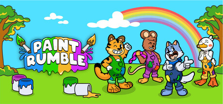
Paint Rumble is a fast-paced party game where strategy and reflexes matter! Cover the most area in 2-minute battles, playing solo, in teams, or against friends locally or online. Choose Wolfy, Quacky, Tigro, or Lucky, grab power-ups, and use your agility to dominate the battlefield!
$1.99No user reviews
ActionCasualPvP
Vitor Cirilo, Marcos Game Dev, Allan MachadoJul 18, 2025