Scoring genre clarity...

Kiloton: Black Company capsule

Kiloton: Black Company

Run a mercenary company scrounging for scraps, unearth manmade horrors, and try not to die or worse -- get fired!

$4.995 user reviews
StrategyCapitalismPost-apocalyptic
SmugpireJun 2, 2025

Kiloton: Black Company scores 75/100 — better than 69% of Strategy capsules (n=5,103).

5 user reviews · $4.99 · Released Jun 2, 2025 · By Smugpire

Quick text summary

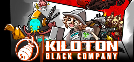
Kiloton: Black Company scored 75/100 on Steam Analyzer — Good for a Strategy capsule. Top priority fix: [uniqueness_polish] Emphasize a signature visual hook—such as a grotesque monster hint, a comedic disaster moment, or a distinctive company emblem—that sets this apart from generic mercenary rosters.

Capsule scores by dimension

  • Genre Clarity: 8/10 — Strategy indie with clear mercenary theme. The capsule immediately communicates a mercenary/tactical strategy game through character silhouettes, military gear, and weapons. At tiny size, the distinct character lineup and equipment iconography remain readable enough to signal indie strategy-action. The red and orange accents reinforce danger and combat, though the crowded character roster slightly dilutes the single focal point that would push this to a 9.
  • Title Readability: 8/10 — Bold, legible title with icon lock-in. The "KILOTON BLACK COMPANY" logo uses clean, thick white lettering on a dark background with a strong red underlay, ensuring readability at all sizes. The circular bomb icon on the left anchors the logo and reads clearly at small and tiny sizes. At tiny size the text remains legible with good contrast, though the subtitle word "BLACK COMPANY" compresses slightly but does not collapse.
  • Contrast & Color: 8/10 — Strong value separation, vibrant highlights. The design leverages high contrast between dark charcoal/black backgrounds and bright white title lettering, plus warm orange-red accents that pop sharply against the Steam dark theme #1b2838. Character silhouettes read well in value separation, and the bomb icon's turquoise and orange details create visual interest without muddiness. Grayscale test shows clear edge definition and silhouette clarity across all sizes.
  • Uniqueness & Polish: 7/10 — Competent cartoon aesthetic, slightly generic. The art style uses clean, cartoon-style character illustrations with a cohesive hand-drawn feel that matches the indie strategy genre well. The composition tells a visual story of a motley mercenary crew, supporting the game's core premise. However, the character assembly feels somewhat like a roster lineup rather than a unique selling point hook, and the overall presentation, while polished, sits comfortably in the indie strategy template rather than standing out distinctly.
  • Brand Consistency: 7/10 — Cartoon aesthetic coherent, icon memorable. The capsule maintains consistent character illustration style, warm earth-tone and red color palette, and a recognizable bomb icon that serves as a brand anchor. The goofy, slightly manic character expressions reinforce a comedic tone consistent with the game description. Coherent rendering across all characters and props suggests strong internal art direction, though without seeing additional materials, the distinctive identity feels somewhat tied to the title rather than a unique visual signature.
  • Composition: 7/10 — Balanced roster, title well-anchored left. The layout places the logo and title on the left with a clear icon anchor, while characters fan across the right and center, creating depth layering from foreground to background. The focal point reads clearly at small size as the title-icon combo, with characters providing supporting visual interest. At tiny size, the composition holds but the number of characters creates minor visual noise; the title placement in safe margins prevents cropping issues, though the right edge feels slightly crowded.

What works

  • Readable logo at all sizes. White text on dark background with red underlay and bomb icon creates a clear, memorable title that does not collapse at tiny size.
  • Genre immediately apparent. Character gear, military aesthetic, and weapon silhouettes clearly signal strategy-action mercenary gameplay without ambiguity.
  • Strong value contrast. High contrast between dark and light elements ensures silhouettes read crisply against the Steam dark theme even at small sizes.
  • Coherent art direction. Consistent cartoon character style and warm color palette create a unified, professional indie aesthetic with no jarring style breaks.

What hurts the capsule

  • Character roster feels generic. While well-drawn, the lineup reads more as a standard character assembly rather than a unique visual hook that distinguishes this from similar indie strategy games.
  • Right edge visual density. Multiple overlapping characters and props on the right side create minor clutter that may compress at tiny size and slightly dilute the primary focal point.
  • Limited narrative storytelling. The capsule shows a roster but does not visually communicate the core mechanic (mercenary company management) or the unique premise (unearth manmade horrors) as clearly as top-tier genre peers.

Priority fixes

  1. [uniqueness_polish] Emphasize a signature visual hook—such as a grotesque monster hint, a comedic disaster moment, or a distinctive company emblem—that sets this apart from generic mercenary rosters.
  2. [composition] Reduce character overlap and crowding on the right edge to create cleaner silhouettes at small and tiny sizes; consider spotlighting 3–4 key characters rather than a full ensemble.
  3. [genre_clarity] Add a subtle UI element (such as a company badge, management screen hint, or horror motif) that communicates the strategy management and horror discovery aspects alongside the combat aesthetic.

Store copy priority fixes

  1. [feature_communication] Clarify the core gameplay loop in the opening of the detailed description: e.g., 'Each turn, complete mercenary contracts to meet your company quota: hire units, deploy them in turn-based tactical combat, loot resources, and manage company finances.' This bridges the management and combat systems.
  2. [hook_strength] Strengthen the short description by leading with a gameplay verb and the unique risk: 'Command your mercenary squad to complete dangerous contracts, manage their lives and loyalty, and race to meet your company quota before being fired.'
  3. [uniqueness] Add a mechanical differentiator in the detailed description, such as: 'Unlike other squad-based tactics games, your company's bottom line is just as lethal as enemy fire—fail to meet quarterly quotas and it's game over.'
  4. [feature_communication] Explain the horror narrative's role explicitly: does it serve as endgame content, a story campaign, or a procedural risk that emerges randomly? Clarify its relationship to the main quota-driven gameplay.

Related guides

  • Steam page optimisationCapsule, copy, screenshots, tags — the full Steam page conversion stack.
  • Steam tags guideTag selection, ordering, and how it shapes Steam's recommendation rails.

Steam app ID: 3535980 · Tags: Strategy, Capitalism, Post-apocalyptic, Singleplayer, Turn-Based Strategy