Scoring genre clarity...
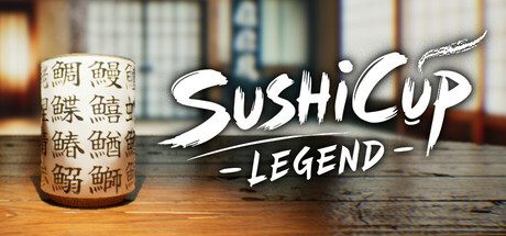
A teacup engraved with the Kanji of seafood used for Sushi. That is the SushiCup. You are the SushiCupMaster who makes the traditional SushiCup, and in order to pass down your skills, you must make sure that the Kanji engraved on the SushiCup made by your apprentice is correct.
$4.99Positive(10)
CasualFunnyComedy
Knight of KarateApr 17, 2025