Scoring genre clarity...

Conveyor Belt Sushi Simulator capsule

Conveyor Belt Sushi Simulator

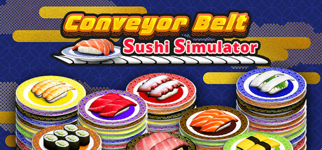
Run your own conveyor belt sushi restaurant. Make sushi, serve customers, process payments, clean tables, hire staff, and design your restaurant’s conveyor belt. Set your own prices, manage troublesome customers, and expand your sushi restaurant.

$12.99Mixed(23)
SimulationCasualImmersive Sim
Mizuki GamesApr 15, 2026

Conveyor Belt Sushi Simulator scores 80/100 — better than 87% of Simulation capsules (n=5,188).

Mixed (23 reviews) · $12.99 · Released Apr 15, 2026 · By Mizuki Games

Quick text summary

Conveyor Belt Sushi Simulator scored 80/100 on Steam Analyzer — Good for a Simulation capsule. Top priority fix: [title_readability] Remove or simplify the red 'Sushi Stimulator' subtitle to ensure all text remains legible at tiny sizes, or increase its size and contrast significantly.

Capsule scores by dimension

  • Genre Clarity: 9/10 — Clear sushi simulation gameplay visual. The capsule immediately communicates a sushi restaurant management game through stacked colorful sushi plates on a conveyor system, paired with the title 'Conveyor Belt Sushi Simulator.' At tiny size, the layered circular plates and recognizable sushi imagery remain instantly legible and establish the casual simulation genre without ambiguity. The visual metaphor of stacked plates directly represents core gameplay mechanics of serving and managing inventory.
  • Title Readability: 8/10 — Bold yellow title with strong contrast. The title uses thick yellow sans-serif letterforms against a dark blue background, creating excellent contrast and maintaining readability at small sizes. The subtitle 'Sushi Stimulator' in red sits cleanly below without overcrowding. At tiny size, the primary title remains clear, though the red subtitle becomes harder to parse, which is a minor legibility compromise.
  • Contrast & Color: 9/10 — High-saturation palette pops effectively. The bright yellow title, vivid multi-colored sushi plates (red, orange, blue, green, pink), and warm yellow conveyor belt create strong value and color separation against the deep blue background. The layered sushi elements have distinct silhouettes with vibrant inner colors that remain visible even in grayscale, and the composition never muddies or blends into the background. Quick-scroll visibility is excellent at all sizes.
  • Uniqueness & Polish: 7/10 — Polished casual aesthetic with playful appeal. The stacked plate design is distinctive and charming, with clean 3D rendering and intentional color coding that suggests progression or variety in sushi types. The composition feels premium and intentionally crafted rather than generic, though the visual hook relies heavily on the recognizable sushi concept rather than a completely original art direction. The yellow and blue palette is cohesive and sets a friendly, accessible tone that matches top casual simulators.
  • Brand Consistency: 7/10 — Consistent playful sushi-focused visual identity. The capsule uses a distinctive warm yellow and saturated color palette that reads as internally consistent and establishes a recognizable brand voice aligned with casual simulation games. The sushi plate motif appears intentional and could become an iconic symbol for the game across marketing materials. However, without reference to other store assets, it is difficult to confirm whether this palette and style appear consistently across all brand touchpoints, limiting the score slightly.
  • Composition: 8/10 — Strong focal hierarchy with clear center arrangement. The stacked sushi plates occupy the center and lower two-thirds, creating a clear primary focal point that guides the eye downward naturally. The title sits at top center with ample breathing room, and the overall layout respects safe margins well, with no critical elements at extreme edges that risk cropping. At small and tiny sizes, the circular plate stack remains the dominant read, though some smaller outer plates lose definition at thumbnail size.

What works

  • Instantly communicates game genre and core mechanic. Conveyor belt and stacked sushi plates immediately signal a management simulation without requiring text parsing.
  • Excellent contrast and color saturation against dark background. Bright yellows, reds, blues, and multi-colored plates pop clearly at all viewing sizes with strong silhouette separation.
  • Title placement and legibility remain strong at small sizes. Bold yellow sans-serif letterforms on controlled dark background ensure readable hierarchy even at tiny scale.
  • Polished 3D rendering with intentional visual hierarchy. Layered plate composition creates depth perception and suggests progression or variety in a professional, crafted manner.

What hurts the capsule

  • Red subtitle becomes illegible at tiny thumbnail size. The 'Sushi Stimulator' text loses clarity at very small scales and risks becoming visual noise rather than readable support text.
  • Limited unique brand differentiation in casual simulator space. While well-executed, the playful casual sushi concept follows familiar aesthetic patterns seen in other top simulators like Supermarket Simulator and TCG Card Shop Simulator.
  • Some outer plate elements lack definition at smallest sizes. Small circular details on the edges of the stacked plate composition compress and merge together when scaled down to tiny thumbnail proportions.

Priority fixes

  1. [title_readability] Remove or simplify the red 'Sushi Stimulator' subtitle to ensure all text remains legible at tiny sizes, or increase its size and contrast significantly.
  2. [composition] Ensure the focal plate stack is centered and slightly larger to maintain silhouette clarity and prevent outer plate details from becoming illegible noise at thumbnail scale.
  3. [uniqueness_polish] Consider adding a distinctive visual hook or character element (e.g., a chef silhouette, unique plate shape, or signature UI element) that differentiates the capsule within the crowded casual simulator space.

Store copy priority fixes

  1. [uniqueness] Highlight the conveyor belt design mechanic explicitly: 'Design your custom conveyor belt layout to optimize customer flow and table efficiency—your layout directly impacts profitability and gameplay pacing.' This is your core differentiator.
  2. [hook_strength] Rewrite the short description opening to lead with emotion or curiosity: 'Design and run a bustling conveyor belt sushi restaurant where every decision—from belt layout to pricing—affects your success.' Replace the task-list tone with active engagement.
  3. [feature_communication] Expand the troublesome customer section with concrete detail: explain what players must do (e.g., appease them, eject them, manage reputation) and why it matters to restaurant stability or profit.
  4. [audience_targeting] Add explicit audience signal in short description or early in detailed copy: 'Perfect for players seeking a relaxing, strategic management experience without real-time pressure' or similar to strengthen targeting.

Related guides

Steam app ID: 3536670 · Tags: Simulation, Casual, Immersive Sim, Life Sim, Relaxing