Scoring genre clarity...
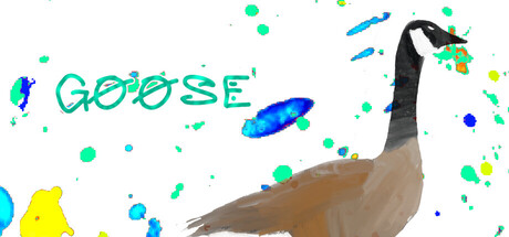
Goose capsule

Goose

GOOSE is a mischievous game where you sneak through levels and pinch as many people as you can. Watch their routines, time your moves, and rack up points—play levels or go endless to see how high your score can go!

$0.99
FPSActionInteractive Fiction
BearFoot StudiosFeb 8, 2026

Goose scores 73/100 — better than 65% of FPS capsules (n=1,272).

$0.99 · Released Feb 8, 2026 · By BearFoot Studios

Quick text summary

Goose scored 73/100 on Steam Analyzer — Good for a FPS capsule. Top priority fix: [genre_clarity] Add subtle environmental or human figure hints to visually communicate the 'pinching people' core mechanic beyond just goose and particles

Capsule scores by dimension

  • Genre Clarity: 8/10 — Clear casual mischief gameplay. The capsule immediately communicates a playful, lighthearted game through the prominent goose character and scattered, colorful particle effects suggesting chaos and fun. At tiny size, the goose silhouette and bright cyan title remain recognizable, clearly signaling a casual indie game rather than action or horror. The visual language of mischief and silliness reads well even at minimal sizes.
  • Title Readability: 7/10 — Readable but decorative treatment. The cyan 'GOOSE' title uses a stylized, slightly irregular typeface that remains legible at full and small sizes due to its bold color and spacing. At tiny size the title maintains clarity, though the decorative letterforms lose some crispness and fine detail. The white background behind the text helps separation, but the overall readability is solid without being exceptional.
  • Contrast & Color: 8/10 — Strong vibrant pop against dark. The bright cyan title and scattered blue, green, and yellow particle effects create excellent value separation against the light beige and white background, which will pop strongly on Steam's dark #1b2838 interface. The goose's brown and black silhouette contrasts well with the light background, and the colorful accent particles draw the eye effectively. Grayscale test confirms solid light-dark separation across all major elements.
  • Uniqueness & Polish: 7/10 — Charming but familiar indie style. The goose character and playful particle aesthetic deliver charm and personality that align well with indie casual games like Little Kitty, Big City and Snufkin. The design feels intentional and cohesive, though the scattered particles and bright colors are fairly common treatments in this genre. The goose itself is distinctive and memorable, elevating the capsule above generic template work.
  • Brand Consistency: 7/10 — Consistent character-driven identity. The goose serves as a strong recognizable brand anchor that should carry across marketing materials and in-game assets. The playful, colorful particle language and cyan accent color create a cohesive visual identity. Without access to the full screenshot set, it appears the goose character and particle effect style would be recognizable across touchpoints, though the identity feels more character-led than palette-led.
  • Composition: 7/10 — Balanced layout with clear focal point. The goose is positioned right of center as the primary focal point, with the cyan title anchored left, creating balanced asymmetry that guides the eye naturally. Scattered particles fill supporting space without creating clutter, and no critical elements sit dangerously close to edges that might be cropped. At small and tiny sizes, the goose remains the clear subject and the title stays readable with ample breathing room.

What works

  • Vibrant color contrast. Cyan, blue, and yellow elements create strong visual pop against the light background and will read clearly on Steam's dark interface.
  • Memorable character anchor. The goose is distinctive and iconic, serving as a strong brand identity that communicates the game's playful personality at any size.
  • Clear genre communication. Casual, lighthearted aesthetic immediately signals indie fun rather than action or horror, matching game description accurately.
  • Readable title at scale. The cyan title remains legible even at tiny thumbnail size despite decorative letterforms.

What hurts the capsule

  • Particle scatter feels generic. Scattered colored dots are a common indie game visual language that doesn't differentiate this capsule from similar casual titles.
  • No mechanical hint in visuals. The capsule shows the goose and chaos but doesn't visually convey the 'pinching' or 'sneaking' core mechanic that defines gameplay.
  • Limited unique art direction. While charming, the simple shapes and bright particle effects lack the distinctive visual polish of top-tier indie capsules like DAVE THE DIVER or Balatro.

Priority fixes

  1. [genre_clarity] Add subtle environmental or human figure hints to visually communicate the 'pinching people' core mechanic beyond just goose and particles
  2. [uniqueness_polish] Refine particle design or add a signature visual motif (icon, symbol, or UI element) that feels more distinctive than generic scattered dots
  3. [composition] Consider whether the title could integrate more directly with the goose scene to create tighter focal point unity, reducing compositional distance

Store copy priority fixes

  1. [genre_clarity] Clarify the 'FPS' tag by adding a sentence about first-person perspective or movement mechanics, or revise the tag if it's a misnomer.
  2. [feature_communication] Expand the NPC reaction system: explain one or two concrete examples of how player timing creates different outcomes (e.g., 'pinch during their pause and they freeze; catch them mid-stride and they bolt').
  3. [audience_targeting] Add a sentence explicitly addressing who this is for: 'Perfect for arcade score-chasers and fans of playful chaos' or similar to narrow audience expectations.

Related guides

Steam app ID: 3537460 · Tags: FPS, Action, Interactive Fiction, First-Person, Dark Comedy