Quick text summary
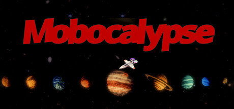
Mobocalypse scored 68/100 on Steam Analyzer — Solid for a Action capsule. Top priority fix: [uniqueness_polish] Replace generic spaceship with a distinctive player character model, enemy silhouette, or weapon that communicates roguelite horde shooter identity and differentiates from generic space games
Capsule scores by dimension
- Genre Clarity: 7/10 — Space shooter action genre readable. The planetary lineup with a small spaceship at center clearly communicates a space-themed action game. At SMALL and TINY sizes, the celestial bodies and spacecraft silhouette remain distinct enough to signal shooter gameplay, though the specific roguelite mechanic isn't visually apparent. The cosmic setting is immediately recognizable as sci-fi action.
- Title Readability: 8/10 — Bold red title stands out well. The title 'Mobocalypse' uses a strong red italic font against black background with excellent contrast and readability at all sizes. At TINY size, the letterforms remain distinct and the word does not collapse, maintaining clarity even during quick scroll. The placement at top occupies safe margin space without edge-hugging risk.
- Contrast & Color: 8/10 — Vibrant red and warm planets pop. The crimson red title stands out sharply against the dark space background, and the warm orange, gold, and blue planets create distinct silhouettes that separate from black void. In grayscale test, the title and planetary bodies maintain clear value separation from the background. The color palette leverages warm-cool contrast effectively for visual pop.
- Uniqueness & Polish: 6/10 — Clean but generic space shooter look. The capsule presents a competent space scene with accurate planetary rendering and a neat layout, but the concept—lined-up planets with a spaceship—is a familiar sci-fi cliché that doesn't communicate what makes Mobocalypse distinct from other space shooters. The craft is solid and professional, but lacks a memorable hook or unique visual identity that suggests roguelite mechanics or horde combat. No character, weapon, or signature art style stands out.
- Brand Consistency: 5/10 — Minimal cohesive identity signals. The capsule uses a clean red-and-black palette consistent with sci-fi branding, but without reference to store screenshots or gameplay visuals, there are no iconic character, enemy, or mechanical motifs that create recognizable identity. The generic planets-and-spaceship arrangement could apply to dozens of space games, offering no memorable Mobocalypse-specific cue. Internal consistency is present but brand distinctiveness is low.
- Composition: 7/10 — Clear hierarchy with centered focus. The layout uses strong top-to-bottom hierarchy: bold red title anchors the top, planets line the middle as a visual anchor point, and the small spaceship acts as a focal point in the center-upper area. At SMALL and TINY sizes, the title and planetary row remain the primary read without clutter. The composition avoids scattered attention and uses depth layering (title, planets, void background) effectively, though the spaceship at tiny size becomes less commanding.
What works
- Strong title contrast and legibility. The red italic 'Mobocalypse' text reads clearly at all sizes including TINY, with excellent value separation from black background.
- Clean, uncluttered layout. The composition uses simple hierarchical arrangement with title, planet row, and void, avoiding visual noise and maintaining quick recognition during scroll.
- Professional planetary rendering. The lined-up planets display polished detail and warm, cool color variety that create visual interest and silhouette clarity.
What hurts the capsule
- Generic space shooter concept. The planets-and-spaceship setup is a familiar sci-fi trope that fails to communicate what makes Mobocalypse unique—no horde aesthetic, roguelite mechanic cue, or distinctive art style is evident.
- Minimal brand identity signals. The capsule lacks iconic characters, enemies, weapons, or visual motifs that would be recognizable as Mobocalypse-specific across marketing materials.
- Spaceship de-emphasized at small size. The small white spaceship at center becomes nearly invisible at TINY size, reducing the focal point impact and making the image feel spaceship-less to quick browsers.
Priority fixes
- [uniqueness_polish] Replace generic spaceship with a distinctive player character model, enemy silhouette, or weapon that communicates roguelite horde shooter identity and differentiates from generic space games
- [genre_clarity] Add a visual cue of mob hordes or enemy density (enemy swarms, particle effects, or combat indication) to clearly signal 'horde shooter' over generic space exploration
- [brand_consistency] Incorporate a signature color accent, character design, or UI element from gameplay to create a recognizable Mobocalypse visual identity
Store copy priority fixes
- [hook_strength] Rewrite the short description to lead with a high-impact action verb and specific consequence: 'Fight through endless waves of pixel monsters, upgrade on the fly, and escape a dying planet—only Rüdiger has your back.' This raises immediate stakes and personality.
- [uniqueness] Add one concrete differentiator in the detailed description, such as a specific weapon archetype, enemy behavior, or progression system that sets this game apart from similar roguelites—for example, 'Rüdiger's shop randomizes each run' or 'chain kills to unlock rare weapons.'
- [feature_communication] Expand the detailed description with 1–2 sentences describing the feel of combat, weapon types, or a signature mechanic to help players visualize actual gameplay beyond the structural loop.
- [audience_targeting] Clarify the intended player with a direct statement: 'Perfect for arcade roguelite fans who love retro pixel shooters' or 'Ideal for players seeking quick runs and steady progression rewards.'
Related guides
Steam app ID: 3537930 · Tags: Action, Action Roguelike, Roguelite, Shoot 'Em Up, 2D