Scoring genre clarity...

After Juice: Animal Disco Mafia capsule

After Juice: Animal Disco Mafia

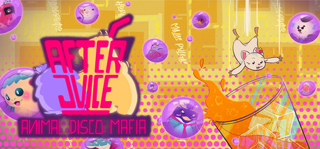
Welcome to our wild neon flashing graphic adventure! Play as Tofu 🐹 a little hamster with a big attitude and experience his misadventures through a frantic college night in a city brimming with parties and mystery. Packed with humor, terrible jokes and tons of dru— I mean, SUGAR!

$5.997 user reviews
Early AccessVisual NovelCasual
Virtual SeedJan 5, 2026

After Juice: Animal Disco Mafia scores 67/100 — better than 12% of Early Access capsules (n=3,067).

7 user reviews · $5.99 · Released Jan 5, 2026 · By Virtual Seed

Quick text summary

After Juice: Animal Disco Mafia scored 67/100 on Steam Analyzer — Solid for a Early Access capsule. Top priority fix: [title_readability] Increase size or add stronger outline to 'ANIMAL DISCO MAFIA' tagline to survive readable at 120px width, or replace with single-word genre indicator like 'PARTY ADVENTURE'

Capsule scores by dimension

  • Genre Clarity: 7/10 — Casual party game vibes clear. The neon disco aesthetic, floating vinyl records, dancing character silhouettes, and party-themed UI elements clearly signal a casual, colorful indie game with humor and whimsy. At tiny size, the bright magenta/purple palette and playful character shapes (hamster visible at left) read as casual arcade or party game rather than serious genre. The visual language matches casual indie expectations but doesn't uniquely identify the specific 'disco mafia' or narrative hook.
  • Title Readability: 5/10 — Title partially readable at small. The large magenta 'AFTER JUICE' text reads clearly at full and small sizes due to bold weight and high contrast against yellow background. However, the smaller 'ANIMAL DISCO MAFIA' tagline at bottom becomes unreadable at tiny size (120x45), collapsing into a pink blur with illegible character detail. At tiny size, only 'AFTER JUICE' survives; the subtext vanishes, losing narrative context.
  • Contrast & Color: 8/10 — Strong vibrant palette with clean pop. The hot magenta, electric purple, and bright yellow create excellent value separation against Steam's dark background #1b2838, with neon vinyl records and character elements reading distinctly even at small sizes. Saturation is intentionally high and cohesive, maintaining silhouette clarity through the busy gradient and particle effects. The warm-to-cool color transition (yellow to purple) guides the eye and prevents muddiness in grayscale squint test.
  • Uniqueness & Polish: 7/10 — Polished neon aesthetic, familiar approach. The capsule exhibits strong craft with clean gradient transitions, intentional layering of vinyl records and geometric shapes, and a distinctive neon disco art direction that feels premium and cohesive. However, the vaporwave/neon aesthetic is a well-worn indie game trope, and the visual doesn't communicate a unique mechanic or narrative hook beyond 'funky party animal game'—it feels like a genre-expected look rather than a signature identity. The execution is excellent but the concept is not particularly novel.
  • Brand Consistency: 6/10 — Consistent aesthetic, minimal identity cues. The capsule maintains a coherent neon disco color palette and playful tone that should carry across marketing materials, with the Tofu hamster character providing a recognizable mascot anchor. However, there are no distinctive brand symbols, iconic typography, or memorable motifs that would allow recognition of this game weeks later—the aesthetic is internally consistent but generic within the neon-casual-indie space. The 'AFTER JUICE' logo is the closest to a signature element, but lacks distinctive treatment.
  • Composition: 7/10 — Clear focal hierarchy, minor edge risk. The oversized 'AFTER JUICE' title dominates the center-left foreground and serves as the clear primary focal point, with floating vinyl records and character elements providing layered depth in background and mid-ground, creating good visual hierarchy. The composition maintains balance and avoids clutter despite the busy gradient. At tiny size, the title remains readable as intended, though the tagline disappears—minor risk of right-edge crop cutting off the 3D geometric shape at extreme cropping.

What works

  • Strong color contrast against dark background. Neon magenta, purple, and yellow palette pops decisively against Steam's #1b2838, with excellent value separation that reads clearly at all sizes down to tiny thumbnails.
  • Primary title reads at all sizes. 'AFTER JUICE' bold treatment maintains legibility from full size through tiny, with clean letterforms and high-saturation backing that survives compression and blur.
  • Cohesive art direction and polish. Gradient transitions, floating elements, and layered depth create a premium, intentional aesthetic that avoids cheap asset appearance and feels craft-driven.
  • Clear focal point and hierarchy. The oversized title anchors the composition and prevents scattered attention, with supporting elements (records, characters, shapes) guiding rather than competing for focus.

What hurts the capsule

  • Tagline unreadable at small/tiny sizes. 'ANIMAL DISCO MAFIA' text collapses into illegible pink blur below 120px width, losing narrative context and subgenre clarity when users scroll thumbnails quickly.
  • Generic neon-disco aesthetic lacks uniqueness. While well-executed, the vaporwave party aesthetic is a saturated indie trope with no distinctive visual hook or mechanic communication that sets it apart from competitors.
  • Limited memorable brand identity. No iconic symbol, signature motif, or distinctive typography treatment that would allow recognition weeks later—internal cohesion is good but external brand distinctiveness is weak.
  • Busy background texture competes for attention. The dotted/halftone pattern in mid-ground, while stylistically appropriate, adds visual noise that slightly reduces title dominance and can feel cluttered on smaller screens.

Priority fixes

  1. [title_readability] Increase size or add stronger outline to 'ANIMAL DISCO MAFIA' tagline to survive readable at 120px width, or replace with single-word genre indicator like 'PARTY ADVENTURE'
  2. [uniqueness_polish] Add a distinctive visual element—iconic Tofu character pose, signature UI frame, or unique particle effect—that creates recognizable brand identity beyond the standard neon-disco look
  3. [contrast_color] Reduce halftone background opacity or replace with cleaner gradient to minimize mid-tone noise and strengthen title contrast at tiny sizes

Store copy priority fixes

  1. [hook_strength] Replace 'Welcome to our wild neon flashing graphic adventure!' with a verb-forward, character-focused opening like 'Play as Tofu, a sarcastic hamster caught in a surreal mystery during the wildest college night in Furrol's history.' to lead with the protagonist and core appeal.
  2. [uniqueness] Add 1-2 sentences explaining what makes this mystery distinct—e.g., 'Uncover a town-wide secret that reshapes how you see your party-loving friends' or similar concrete narrative hook that differentiates from generic mystery VNs.
  3. [feature_communication] Clarify the personality-shaping mechanic: specify whether personality choices branch dialogue, affect which quests unlock, or change Tofu's status effects to help players understand the depth of player agency.
  4. [audience_targeting] Add a brief sentence signaling the ideal player: 'Perfect for fans of absurdist humor, character-driven indie games, and visual novels who want laughs over high stakes' to sharpen audience clarity.

Related guides

Steam app ID: 3538130 · Tags: Early Access, Visual Novel, Casual, 3D, Dialogue Heavy