Rush The Towers scores 63/100 — better than 7% of Strategy capsules (n=5,103).

Quick text summary

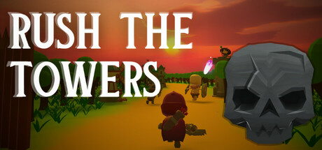
Rush The Towers scored 63/100 on Steam Analyzer — Solid for a Strategy capsule. Top priority fix: [uniqueness_polish] Add a distinctive visual element or art style unique to Rush The Towers—such as a custom character sprite, signature icon, or stylized tower design—that differentiates it from generic tower defense games and creates a memorable brand identity.

Capsule scores by dimension

  • Genre Clarity: 7/10 — Tower defense strategy readable. The skull icon and tower silhouettes in the background clearly signal a defensive strategy game at FULL size. At TINY size, the skull and tower shapes remain distinguishable, though the exact genre becomes less obvious without the contextual tower elements being larger and more prominent.
  • Title Readability: 8/10 — Strong white title stands out. The white sans-serif title 'RUSH THE TOWERS' has excellent contrast against the warm orange-brown background and remains legible at SMALL and TINY sizes due to bold weight and clear spacing. The all-caps treatment and clean letterforms maintain readability even at thumbnail scale without any collapse or blurring issues.
  • Contrast & Color: 7/10 — Warm gradient with decent separation. The orange-red sunset gradient provides warm, saturated color that contrasts adequately against Steam's dark background, and the white title pops well. The gray skull and dark tower silhouettes read clearly in grayscale, though the middle tones of the landscape blend somewhat into the gradient, reducing overall silhouette sharpness at TINY size.
  • Uniqueness & Polish: 5/10 — Generic tower defense presentation. The composition uses familiar tower defense iconography (skull, towers, landscape) without a distinctive visual hook or memorable art style that sets it apart from other strategy games in the genre. While competently rendered, the scene reads as a standard tower defense setup rather than communicating a unique mechanic or visual identity that would make it memorable at quick-scroll speeds.
  • Brand Consistency: 5/10 — Unclear identity without context. The capsule relies on generic tower defense symbols (skull, towers) that do not establish a recognizable brand identity or iconic visual language unique to Rush The Towers. Without examining the 5 store screenshots, there is no distinctive palette, character style, or motif visible that would be consistently recognizable across marketing materials.
  • Composition: 6/10 — Centered layout with balanced elements. The title anchors the upper-left and center-left area with clear hierarchy, while the skull and towers occupy the right and center-right space, creating a roughly balanced composition. At TINY size, the focal point becomes diffuse—the skull and landscape compete for attention rather than one element dominating clearly, and the safe margins appear reasonable though the character silhouette in the center-left lacks visual weight to anchor the composition.

What works

  • Excellent title contrast and legibility. White bold sans-serif text maintains perfect readability across FULL, SMALL, and TINY sizes with no letterform collapse.
  • Warm color palette fits genre mood. The orange-red sunset gradient creates an engaging, warm aesthetic that stands out against Steam's dark background and suggests action and urgency.
  • Clear hierarchy with title priority. The all-caps white title dominates the upper portion and draws the eye first, establishing strong visual hierarchy.

What hurts the capsule

  • Generic visual identity. The skull and tower elements are common tower defense tropes with no distinctive style or memorable brand hook unique to this game.
  • Soft focal point at small sizes. At TINY size, the character silhouette, skull, and towers compete for attention rather than creating a single clear primary subject, reducing immediate genre recognition.
  • Limited silhouette separation in landscape. The midground tower shapes and landscape blend into the gradient background, weakening depth layering and overall silhouette clarity in grayscale.

Priority fixes

  1. [uniqueness_polish] Add a distinctive visual element or art style unique to Rush The Towers—such as a custom character sprite, signature icon, or stylized tower design—that differentiates it from generic tower defense games and creates a memorable brand identity.
  2. [composition] Strengthen the primary focal point at TINY size by enlarging or sharpening the skull or a key character element in the center, and reduce competing elements to create clearer visual hierarchy.
  3. [contrast_color] Darken or add an outline to the tower silhouettes in the landscape to separate them from the gradient background and improve silhouette clarity in grayscale.

Store copy priority fixes

  1. [hook_strength] Rewrite the short description to lead with the core verb: 'Command a small squad to breach enemy towers using tactical positioning and real-time decision-making' instead of the binary outcome framing.
  2. [feature_communication] Expand the feature list with concrete mechanics: specify what each warrior type does (e.g., 'warriors absorb damage, archers deal ranged attacks'), explain how healing and speed systems interact, and give examples of tactical choices.
  3. [uniqueness] Replace generic language like 'unprecedented tactical challenge' with specifics: 'Tower Offense means you attack instead of defend—manage a fragile squad as you assault fortified positions' to reinforce the differentiator.
  4. [audience_targeting] Add a sentence clarifying the intended player: 'Perfect for strategy fans seeking bite-sized tactical battles with high replayability' or similar, to help the right audience self-identify.

Related guides

  • Steam page optimisationCapsule, copy, screenshots, tags — the full Steam page conversion stack.
  • Steam tags guideTag selection, ordering, and how it shapes Steam's recommendation rails.

Steam app ID: 3541190 · Tags: Strategy, Casual, RTS, Action RTS, Colorful