Scoring genre clarity...

Embers of the Night capsule

Embers of the Night

In the game, day and night alternate. Zombies will not be active during the day, so you can build your home with confidence. But at night you have to resist hordes of zombies and guard your camp!

$5.84Mostly Positive(94)
ZombiesOutbreak SimExploration
巨浪游戏Jan 23, 2026

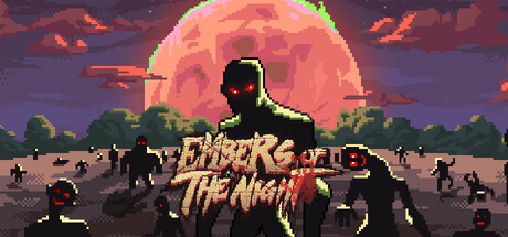
Embers of the Night scores 68/100 — better than 21% of Zombies capsules (n=672).

Mostly Positive (94 reviews) · $5.84 · Released Jan 23, 2026 · By 巨浪游戏

Quick text summary

Embers of the Night scored 68/100 on Steam Analyzer — Solid for a Zombies capsule. Top priority fix: [title_readability] Simplify the title font by reducing or removing lightning effects to improve legibility at small and tiny sizes while maintaining the glowing golden color.

Capsule scores by dimension

  • Genre Clarity: 7/10 — Zombie survival action clear. The silhouette of a figure facing a large moon with zombie hordes in the foreground immediately signals zombie survival gameplay. The pixelated art style and apocalyptic setting with active undead masses communicate action-adventure combat focus. At tiny size, the moon and zombie silhouettes remain recognizable, though the specific day/night cycle mechanic is not visually evident from the image alone.
  • Title Readability: 6/10 — Readable but decorative styling. The title 'EMBERS OF THE NIGHT' uses a bold, glowing golden-yellow font with electrical/lightning effects overlaid, positioned center below the focal zombie figure. At full size it is clearly readable, but at tiny size the decorative lightning effects and serif styling cause the letters to blur slightly and reduce legibility. The tagline or secondary text below remains unreadable at small sizes due to scale reduction.
  • Contrast & Color: 8/10 — Strong warm-cool value separation. The warm coral and orange tones of the massive moon and sky create excellent contrast against the cool purple-blue midtones and dark silhouettes of the zombie horde and figure. The golden title text pops distinctly from the dark ground layer. In grayscale, the value separation remains strong, with the bright moon and light figure clearly separated from dark foreground masses.
  • Uniqueness & Polish: 7/10 — Polished pixel art with atmosphere. The capsule demonstrates solid craft with layered depth, a cohesive pixelated art direction, and clear atmospheric storytelling through the large threatening moon and encroaching horde. The composition feels intentional and thematic rather than generic asset placement. However, the 'large moon with zombie horde' visual is a familiar trope in survival games, reducing the distinctive hook slightly.
  • Brand Consistency: 6/10 — Thematic but generic identity. The zombie survival aesthetic and pixel art style are internally consistent with the game's day-night cycle mechanic, but the visual language lacks a distinctive signature that would make this capsule instantly recognizable as 'Embers of the Night' versus other pixel-art zombie games. No unique character, symbol, or color palette cue appears memorable enough to stand out across multiple browsing sessions.
  • Composition: 7/10 — Clear focal hierarchy, balanced. The large moon serves as the dominant background anchor, the central zombie figure as the primary focal point, and the horde masses as supporting depth layer. The title placement below is readable without fighting the focal character. At tiny size, the moon and central figure remain the clear primary read. Safe margins are respected, and the composition does not rely on edge elements that would be cropped.

What works

  • Excellent warm-cool contrast. The glowing coral moon and orange sky create strong value separation against purple-blue shadows and dark zombie silhouettes, ensuring visibility even against the dark Steam background.
  • Clear focal hierarchy and depth. Distinct layering of background moon, midground figure, and foreground horde creates visual depth that reads cleanly at all sizes including tiny thumbnails.
  • Thematic pixel art execution. The consistent pixelated style reinforces the retro survival game feel and demonstrates intentional aesthetic direction rather than generic asset assembly.

What hurts the capsule

  • Decorative title effects reduce legibility. The lightning/electrical overlay on the golden text adds visual interest but compromises readability at small and tiny sizes where details blur together.
  • Generic zombie survival imagery. The 'moon with approaching horde' composition is a familiar trope that does not establish a distinctive brand identity unique to Embers of the Night.
  • No visible day-night mechanic cue. The core gameplay hook (alternating day/night cycles for different strategies) is not communicated in the capsule imagery, reducing clarity of the unique selling point.

Priority fixes

  1. [title_readability] Simplify the title font by reducing or removing lightning effects to improve legibility at small and tiny sizes while maintaining the glowing golden color.
  2. [uniqueness_polish] Add a distinctive visual element or character silhouette unique to Embers of the Night that could serve as a recognizable brand identity across marketing materials.
  3. [genre_clarity] Incorporate a visual indicator of the day-night cycle mechanic, such as a split sun-moon image or time indicator, to communicate the unique survival strategy element.

Store copy priority fixes

  1. [uniqueness] Rewrite the opening of the detailed description to highlight one specific mechanic or combination of mechanics that competitors do not offer (e.g., 'Unlike other zombie sims, every item you craft and every survivor you recruit permanently shapes your camp's playstyle' or 'The bio-enhancement system lets you create builds that fundamentally change how you approach combat'). This should replace or immediately follow the current first sentence.
  2. [tone_match] Replace corporate phrasing ('roguelite elements,' 'Simulation Management,' 'tactical approach') with language that evokes the player experience: instead of 'roguelite elements,' say 'each run feels different'; instead of 'Tactical Combat (Nighttime),' say 'ruthless nighttime assaults force you to adapt or perish.'
  3. [audience_targeting] Add one sentence early in the detailed description signaling difficulty and player type: 'Built for strategy players who enjoy optimization and resource planning over reflexes' or 'Designed for players who love building defenses and experimenting with survivor synergies.' This clarifies who should buy and who should skip.
  4. [hook_strength] Consider opening the short description with a stronger emotional or strategic hook: 'Every dawn you rebuild; every dusk the undead return—outthink them or perish' or 'Daylight is your planning window; nightfall tests your survival strategy' to move beyond pure mechanic listing into player agency.

Related guides

Steam app ID: 3543120 · Tags: Zombies, Outbreak Sim, Exploration, Adventure, Sandbox