Scoring genre clarity...

Rollover capsule

Rollover

Rollover is a brutally punishing climbing game where every roll could be your last. With unpredictable, difficult physics and a movement system designed to test your limits.

$4.99No user reviews
AdventurePsychological HorrorAction
KevinsundeMar 27, 2025

Rollover scores 70/100 — better than 33% of Adventure capsules (n=7,922).

No user reviews · $4.99 · Released Mar 27, 2025 · By Kevinsunde

Quick text summary

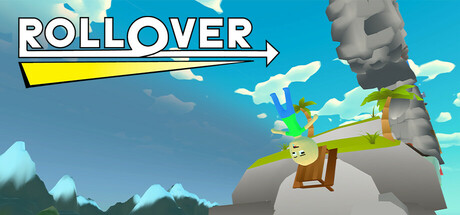
Rollover scored 70/100 on Steam Analyzer — Good for a Adventure capsule. Top priority fix: [genre_clarity] Add visual cues that communicate struggle or difficulty—consider showing a failed attempt, cracks on the sphere, or a more precarious/dynamic pose that hints at the brutal physics challenge.

Capsule scores by dimension

  • Genre Clarity: 7/10 — Climbing puzzle mechanic clear. The capsule immediately communicates a physics-based climbing or rolling game through the character balanced on a spherical object and the directional arrow pointing upward. The stylized art and character pose clearly suggest an action-puzzle title rather than combat-focused action. At tiny size, the sphere-character relationship and upward arrow remain readable, though genre specificity softens—it reads as 'quirky action' rather than distinctly 'brutal climbing'.
  • Title Readability: 8/10 — Bold title, excellent contrast. ROLLOVER is rendered in large, white uppercase letters with a thick outline and yellow underline, positioned in the top-left quadrant on a controlled blue sky background. The letterforms remain fully legible at small and tiny sizes with strong value separation from the background. The supporting arrow reinforces the title's meaning without competing for attention.
  • Contrast & Color: 8/10 — Strong value separation throughout. The bright blue sky provides excellent contrast against the character (brown tunic), stone structures (gray), and green platform. White title text pops sharply against both blue and yellow elements. Even in grayscale, the composition maintains clear silhouette definition and edge clarity at all sizes, with no muddy midtones obscuring the focal subject.
  • Uniqueness & Polish: 6/10 — Competent, whimsical but generic. The art style is clean and charming with consistent stylization (rounded forms, soft shading, vibrant palette), but the core visual—a character on an object in a bright sky—lacks a distinctive hook that communicates what makes Rollover mechanically unique or memorable. The 'brutally punishing physics' and 'unpredictable difficulty' are not visually conveyed; the capsule feels more lighthearted and puzzle-like than dangerous or demanding.
  • Brand Consistency: 6/10 — Consistent art style, minimal identity. The capsule demonstrates a cohesive stylized aesthetic (soft cel-shading, warm earth tones, bright primary colors) that likely matches in-game visuals. However, there are no iconic character designs, signature motifs, or distinctive brand markers that would make this recognizable as Rollover specifically—the character design is generic, and the visual language mirrors many indie adventure puzzlers. Internal consistency is solid but external distinctiveness is limited.
  • Composition: 7/10 — Clear focal point, safe layout. The character-on-sphere relationship anchors the center with the title secured top-left, creating a balanced hierarchy. The stone pillar provides vertical depth context and background definition. At small and tiny sizes, the focal subject remains clear and the layout does not suffer from edge cropping risk. Minor issue: the composition feels slightly safe and centered, lacking the dynamic tension or unexpected framing that would elevate it to premium polish.

What works

  • Title legibility and contrast. ROLLOVER's white outline text with yellow underline remains fully readable at tiny sizes with strong separation from the blue background.
  • Clean art direction and palette. Consistent stylized rendering with vibrant, harmonious colors (blue, yellow, green, earth tones) creates visual coherence and a pleasant first impression.
  • Focused composition with clear subject. The character-on-sphere relationship is the unambiguous focal point, supported by supporting elements (pillar, arrow, sky) that guide rather than distract.

What hurts the capsule

  • Genre identity mismatch. The whimsical, charming visual tone does not communicate the brutal, punishing difficulty and unpredictable physics that define the game's core appeal.
  • Generic character and premise. The protagonist design and scene setup lack memorable or distinctive visual markers that would make Rollover recognizable among similar indie puzzle-climbers.
  • Missing mechanical clarity. The capsule does not visually convey what makes the rolling/climbing system unique or why it would be challenging—the preview reads as lighthearted, not difficult.

Priority fixes

  1. [genre_clarity] Add visual cues that communicate struggle or difficulty—consider showing a failed attempt, cracks on the sphere, or a more precarious/dynamic pose that hints at the brutal physics challenge.
  2. [uniqueness_polish] Introduce a signature visual element (distinctive character trait, iconic object detail, or visual theme) that makes Rollover visually distinct from generic climbing puzzlers.
  3. [contrast_color] Increase saturation or add subtle contrast accent (glowing elements, shadow depth) to the character to further separate it from the background at tiny sizes.

Store copy priority fixes

  1. [feature_communication] Replace 'unpredictable, difficult physics' with a concrete description of the rolling and climbing mechanic: e.g., 'Master a sensitive rolling physics system where momentum carries you upward—and backward—in equal measure. One mistimed input sends you tumbling.'
  2. [uniqueness] Add a paragraph explaining how the sanity mechanic specifically works and how it changes gameplay as you progress—e.g., does the UI degrade, do controls become harder, does the camera shift?—to establish a clear differentiator from other platformers.
  3. [feature_communication] Expand the Gameplay section with a single structured paragraph instead of bullets: explain checkpoint placement, total playtime, what the climb looks like, and whether speedrunning is a core mode (since speed is heavily emphasized).
  4. [genre_clarity] Rewrite the short description to lead with '3D climbing platformer' instead of burying genre in 'climbing game' to eliminate ambiguity in initial scan.

Related guides

Steam app ID: 3544120 · Tags: Adventure, Psychological Horror, Action, Difficult, Precision Platformer