Scoring genre clarity...
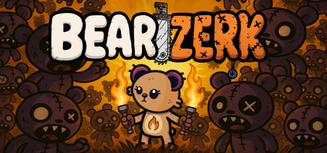
Bearzerk capsule

Bearzerk

Unleash plush fury in Bearzerk, a chaotic survivor-like auto-shooter packed with stuffed heroes, wild weapons, loyal pets, and absurd mounts. Survive 20 intense waves or dive into endless mode—stitched madness awaits!

$4.99Mostly Positive(10)
ActionCasualRoguelike
Dadbod GamesSep 21, 2025

Bearzerk scores 77/100 — better than 79% of Action capsules (n=8,535).

Mostly Positive (10 reviews) · $4.99 · Released Sep 21, 2025 · By Dadbod Games

Quick text summary

Bearzerk scored 77/100 on Steam Analyzer — Good for a Action capsule. Top priority fix: [uniqueness_polish] Introduce a signature visual motif or iconic symbol unique to Bearzerk's world that appears consistently across marketing materials to increase brand memorability.

Capsule scores by dimension

  • Genre Clarity: 8/10 — Clear casual action shooter identity. The central cute bear character surrounded by hostile mechanical enemies immediately signals a quirky action-casual hybrid. Weapon icons, enemy variety, and chaotic composition all reinforce the auto-shooter survivor genre at full size. At TINY size, the bear silhouette and surrounding enemies still read as action-oriented despite detail loss, though the specific 'casual' tone becomes harder to parse.
  • Title Readability: 8/10 — Strong bold title with good contrast. BEARZERK uses chunky white lettering with clean black outlines that maintains legibility across all sizes. The split color treatment (white and orange) adds visual interest without compromising clarity. At TINY size, the title remains readable though fine serif details soften, but the overall letterform silhouette stays intact and recognizable.
  • Contrast & Color: 8/10 — Warm palette pops cleanly against dark background. The orange and brown color scheme creates strong value separation against Steam's dark #1b2838 background, with golden gradients adding depth and warmth. The white title and light bear character create clear focal separation from the darker mechanical enemies. In grayscale mental test, the light-to-dark contrast remains distinct and avoids muddy mid-tone collapse.
  • Uniqueness & Polish: 7/10 — Playful aesthetic with solid craft execution. The cute-meets-chaotic visual style feels distinctive within the survivor-like genre, avoiding the dark grimdark aesthetic of many competitors. The art direction is coherent with intentional color choices and illustrative polish. However, the composition relies on familiar 'character surrounded by enemies' trope common in casual action games, limiting the originality factor to competent rather than exceptional.
  • Brand Consistency: 7/10 — Cohesive cute character and world identity. The bear character design, warm color palette, and mechanical enemy aesthetic establish clear internal visual consistency that could support brand recognition. The chunky illustrative style and playful tone align with casual game positioning. The design lacks a truly iconic symbol or signature motif that would make it instantly recognizable across different marketing assets, keeping it solidly competent rather than memorable.
  • Composition: 8/10 — Well-balanced hierarchy with clear focal point. The bear character sits naturally at center with hostile enemies distributed around it, creating clear foreground-midground-background layering. The title placement at top allows breathing room without obscuring the character. The radial enemy composition draws the eye inward to the bear, and the design maintains focus clarity at SMALL and TINY sizes where the central character remains the obvious primary subject.

What works

  • Distinctive art style. The plush character combined with mechanical enemies creates a memorable visual contrast that stands apart from generic survivor-like games.
  • Title execution. Clean, bold lettering with proper contrast and outline treatment ensures BEARZERK remains legible across all viewing sizes without collapse.
  • Color harmony. Warm orange and brown palette creates strong visual pop against Steam's dark background while maintaining cohesion and avoiding garish appearance.
  • Focal clarity. The bear character commands immediate attention as the primary subject with enemies framing rather than competing for focus.

What hurts the capsule

  • Generic composition framework. The 'character surrounded by enemies' layout is a common trope in action games, reducing the capsule's unique visual hook.
  • Limited brand iconography. While the bear is charming, there are no distinctive symbols, patterns, or signature visual elements that would create instant brand recognition.
  • Enemy design clarity at tiny size. The mechanical enemy details blur significantly at TINY size, losing the comedic ugly-cute character that makes them entertaining.

Priority fixes

  1. [uniqueness_polish] Introduce a signature visual motif or iconic symbol unique to Bearzerk's world that appears consistently across marketing materials to increase brand memorability.
  2. [genre_clarity] Add subtle UI elements or weapon silhouettes in the background that more clearly communicate the 'auto-shooter survivor' subgenre at TINY size.
  3. [contrast_color] Ensure the mechanical enemies have slightly higher value separation from background elements to maintain silhouette clarity at TINY and SMALL sizes.

Store copy priority fixes

  1. [feature_communication] Replace or clarify the synergy mechanics with a concrete example, e.g., 'Stack fire weapons with crit multipliers to create exponential damage chains' instead of relying on 'synergy madness.'
  2. [genre_clarity] Add one sentence early in the detailed description explicitly naming the comparison to Survivors, Vampire Survivors, or similar if that is intentional market positioning.
  3. [audience_targeting] Include a brief note on difficulty scaling or accessibility options to clarify whether this is beginner-friendly or demands mechanical skill, since 'Casual' and 'bullet hell' tags could conflict.

Related guides

Steam app ID: 3545290 · Tags: Action, Casual, Roguelike, Action Roguelike, Bullet Hell