Scoring genre clarity...
Scoring genre clarity...
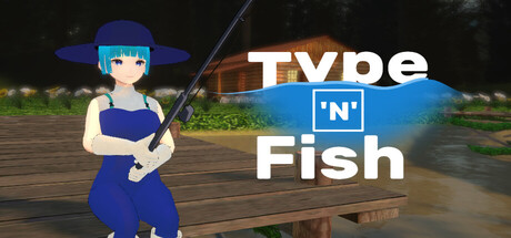
Type 'n' Fish scores 68/100 — better than 18% of Casual capsules (n=10,512).
6 user reviews · $4.99 · Released Mar 14, 2025 · By CapCat
Type 'n' Fish scored 68/100 on Steam Analyzer — Solid for a Casual capsule. Top priority fix: [uniqueness_polish] Add a visual element or particle effect that hints at the typing mechanic—such as floating letters, keyboard keys, or text glyphs near the fish or rod to communicate the unique gameplay hook.
Steam app ID: 3546760 · Tags: Casual, Indie, Simulation, Female Protagonist, Word Game