Scoring genre clarity...
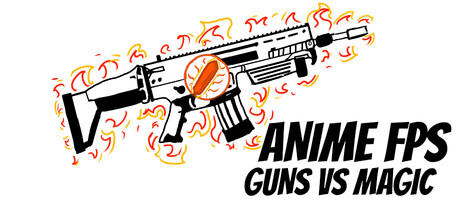
An isekai with anime vibes, hellish bullet storms and fast-paced FPS combat. Imagine being thrown into a world of chaos - bullets flying everywhere, relentless bosses... and death? It's just the beginning in this roguelike action ride.
$12.99Mixed(18)
Early AccessXianxiaAnime
BEPLAYERJul 25, 2025