Scoring genre clarity...
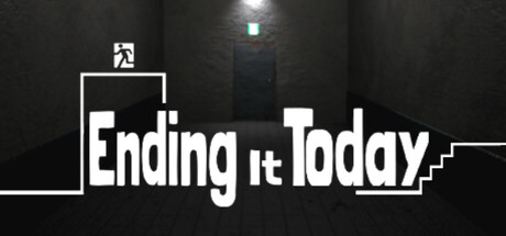
Ending it Today is a psychological horror jump map simulator. Climb 20 floors through collapsed staircases and eerie anomalies. If you see something strange, take the left door. If not, go right. Every five floors bring new themes, heightening the tension.
$2.993 user reviews
3D PlatformerPsychological HorrorSingleplayer
BlueBlue gamesJul 15, 2025