Scoring genre clarity...

Poly-Vinyl Pests! capsule

Poly-Vinyl Pests!

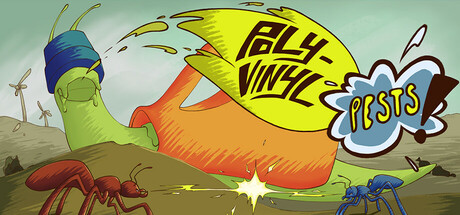
Poly-Vinyl Pests! takes place many years in the future, where humans are long gone but plastics still litter the earth. Play as two ants from rival colonies in this twin-stick shooter to both squash plastic-laden pests and to prove the superiority of your colony!

Free to PlayPositive(23)
ActionStrategyArcade
IDX LegendsMay 2, 2025

Poly-Vinyl Pests! scores 72/100 — better than 46% of Action capsules (n=8,534).

Positive (23 reviews) · Free to Play · Released May 2, 2025 · By IDX Legends

Quick text summary

Poly-Vinyl Pests! scored 72/100 on Steam Analyzer — Good for a Action capsule. Top priority fix: [title_readability] Reposition or enlarge the title text outside the yellow circle, or use a bold outline treatment to improve legibility at small and tiny sizes.

Capsule scores by dimension

  • Genre Clarity: 8/10 — Clear twin-stick shooter gameplay. The capsule effectively communicates action gameplay through the large insect character in dynamic pose, bright yellow circular UI element suggesting targets or power-ups, and visible game world with ground-level perspective typical of top-down shooters. At tiny size, the bold character silhouette and central yellow circle maintain genre clarity, though the specific twin-stick mechanic is not explicitly visual—the overall composition reads unmistakably as arcade action.
  • Title Readability: 7/10 — Title readable but slightly obscured. The title 'POLY VINYL PESTS!' is displayed in bold black lettering on the yellow circular element, providing strong contrast against that background shape. However, at tiny size the text compresses and shares visual real estate with the yellow circle, creating minor legibility strain; the exclamation mark and overall message remain clear but not dominant. At full size the title reads confidently, but the small capsule size tests clarity limits.
  • Contrast & Color: 8/10 — Strong value separation and saturation. The composition uses vibrant warm colors (orange, yellow) against cooler background tones (pale green-blue sky, brown earth), creating excellent value contrast that pops against Steam's dark background #1b2838. The character's blue head and orange body provide clear silhouette definition even at tiny size, and the bright yellow circle acts as a focal point beacon. Saturation is controlled—the palette feels cohesive rather than chaotic, supporting both visibility and polish.
  • Uniqueness & Polish: 7/10 — Charming cartoon style, slightly generic. The vector-art cartoon aesthetic with clean linework and playful character design feels intentional and polished, supporting the lighthearted 'Pests' theme effectively. The giant ant in exaggerated pose with visible colony ants in the scene communicates the core mechanic (ant vs. pest conflict) clearly and with charm. However, the overall composition reads as competent indie-game style without a standout visual hook that would distinguish it from other colorful indie shooters—it is well-executed but not premium-feeling compared to genre benchmarks.
  • Brand Consistency: 6/10 — Cohesive but not deeply iconic. The art direction is internally consistent—clean vector cartoon style, warm-cool color palette, playful ant/insect proportions, and a cheerful tone that align with the title and premise. The large blue-head ant character could serve as a recognizable mascot, but there are no signature symbols, distinctive logo treatments, or unmistakable visual motifs that would be instantly recalled in game libraries. The style feels genuine but not memorable as a franchise identity.
  • Composition: 7/10 — Clear focal point, well-balanced layout. The giant ant commands the center-left area as the primary subject, with the yellow circle and 'POSTS!' text providing secondary focal points on the right, creating a natural left-to-right reading flow. Smaller ants and ground elements anchor the composition in the lower half, establishing depth and context without competing for attention. At tiny size, the main ant silhouette and yellow circle remain the dominant read, though the small text on the circle becomes slightly illegible—overall composition survives the size reduction well with no critical edge-cropping risks.

What works

  • Strong character silhouette. The large ant character has a distinctive, exaggerated proportions and bold outline that reads clearly as the primary subject at all sizes, immediately communicating that you play as an insect.
  • Warm-cool color harmony. Orange, yellow, and blue tones provide excellent saturation contrast and value separation against the dark Steam background while maintaining internal palette cohesion.
  • Playful genre communication. The absurdist premise (ants vs. plastic pests in a post-human world) translates visually into a memorable scene that hints at both action and humor without feeling generic.

What hurts the capsule

  • Title legibility at tiny size. The 'POLY VINYL PESTS!' text compressed onto the yellow circle becomes difficult to read at capsule thumbnail sizes, weakening brand name recall.
  • Lack of iconic visual signature. While the ant design is competent, there are no distinctive logos, symbols, or trademark visual elements that would make this capsule instantly recognizable in a game library.
  • Generic indie aesthetic. The clean vector-cartoon style, while polished, follows familiar indie shooter conventions without a premium or standout visual hook that competes with top-tier genre benchmarks.

Priority fixes

  1. [title_readability] Reposition or enlarge the title text outside the yellow circle, or use a bold outline treatment to improve legibility at small and tiny sizes.
  2. [uniqueness_polish] Introduce a signature brand element (e.g., colony insignia, distinctive logo, or visual motif) that can be recognized and associated with Poly-Vinyl Pests across marketing materials.
  3. [brand_consistency] Add a subtle logo or icon mark in a corner (top-left or bottom-right) that reinforces identity without cluttering the composition.

Store copy priority fixes

  1. [feature_communication] Expand the 'Gain upgrades!' section with 1–2 examples: 'Upgrade your exoskeleton for speed, firepower, or defensive shields to customize your playstyle.' This gives players a mental model of progression.
  2. [uniqueness] Add a sentence after the 'Cooperate and compete!' section that articulates a unique mechanical hook: 'Balance teamwork and competition—help your ally while sabotaging their score, or go fully solo.' This differentiates the co-op experience.
  3. [hook_strength] Simplify the short description's closing clause to: 'Play as rival ant champions to defeat mutated pests and claim the colony throne.' This removes redundancy and sharpens the competitive hook.

Related guides

Steam app ID: 3554420 · Tags: Action, Strategy, Arcade, Bullet Hell, Shooter