Scoring genre clarity...
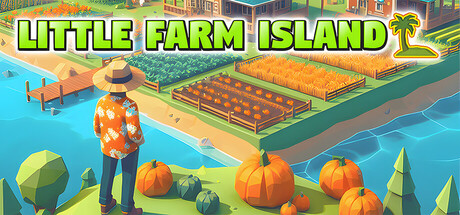
Ditch boring farm life! Little Farm Island packs farming, exploration, dumpster diving, and gritty survival. Expect weird characters, mysterious secrets, drunkenness, and enough facepalm moments for your meme gallery. Get ready for a wild, messy, hilarious ride!
$100.001 user reviews
Early AccessFunnyExploration
DiogoshxMar 28, 2025