Scoring genre clarity...

Caput Mortum capsule

Caput Mortum

Travel back to 16th-century France and delve into the mysterious depths of a seemingly abandoned alchemist's tower. Do you dare brave the horrors that beckon you below... deeper still?

$11.99Very Positive(10)
ExplorationPuzzleSurvival Horror
WildArts GamesAug 27, 2025

Caput Mortum scores 70/100 — better than 33% of Exploration capsules (n=4,872).

Very Positive (10 reviews) · $11.99 · Released Aug 27, 2025 · By WildArts Games

Quick text summary

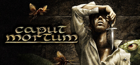
Caput Mortum scored 70/100 on Steam Analyzer — Good for a Exploration capsule. Top priority fix: [title_readability] Simplify the decorative font weight and underline treatment to improve clarity at sizes below 231×87, prioritizing legibility over ornamental styling without losing the Latin alchemical theme.

Capsule scores by dimension

  • Genre Clarity: 7/10 — Dark adventure with alchemical mystery. The classical bust, ornate stone tower aesthetic, and insects suggest a historical or Gothic adventure setting aligned with the 16th-century alchemist premise. At tiny size, the statue and decomposed elements read as eerie and period-appropriate, though the exact genre (puzzle adventure vs. horror vs. exploration) remains slightly ambiguous without the full context. The visual leans convincingly toward dark adventure rather than action or combat genres.
  • Title Readability: 6/10 — Readable but antiquated styling. The 'caput mortum' text uses a decorative serif font with Latin flourishes that reads clearly at full size but becomes strained at small size due to ornamental underlines and thin letterforms. At tiny size (120×45), the title remains technically legible but loses its elegant refinement and begins to blur into a compact mass. The underline treatment and decorative styling prioritize theme over scalability.
  • Contrast & Color: 8/10 — Strong value separation and clarity. The cream and pale stone tones of the bust and statue create excellent contrast against the dark mottled background (#1b2838 equivalent), with warm golden insects providing secondary accent points. Even at tiny size, the light figure silhouette reads distinctly against the murky background, and the grayscale test confirms strong value separation without muddy mid-tones. The warm ochre text adds further visual hierarchy without overwhelming the composition.
  • Uniqueness & Polish: 7/10 — Distinctive period aesthetic, subtle craft. The classical bust paired with insects and alchemical decay creates a memorable visual hook that feels intentional and thematic rather than generic. The stone texture, careful lighting on the sculpture, and symbolic insect placement demonstrate thoughtful art direction specific to the 16th-century alchemist setting. However, the execution feels slightly restrained—while polished, it doesn't quite match the premium distinction of top-tier adventure capsules like DREDGE or The Invincible, which command more visual surprise or narrative intrigue.
  • Brand Consistency: 7/10 — Coherent classical and decay theme. The capsule establishes a clear internal identity: classical European architecture meets dark decay, with insects as a symbolic motif for death and transformation (aligning with 'caput mortum,' or death's head). The stone-on-stone palette, warm gold accents, and consistent weathered aesthetic suggest a recognizable visual language. Without access to the 12 store screenshots, consistency cannot be fully verified, but the capsule projects a unified classical-dark aesthetic that feels deliberate and traceable.
  • Composition: 7/10 — Clear focal point, slightly cramped edges. The classical bust anchors the right-center of the frame as the dominant focal point, with the title occupying the left side and insects distributed for secondary visual interest. At small size, the composition reads cleanly with the statue as the primary draw and text as supporting hierarchy. However, at tiny size, the left-edge placement of the title and right-edge position of the bust create slight tension; the composition feels slightly compressed, and important elements sit close to crop zones where Steam might clip them on certain display contexts.

What works

  • Strong contrast readability at all sizes. The pale bust against the dark background maintains clear silhouette separation even at tiny 120×45 view, ensuring the core image reads instantly during quick scrolling.
  • Thematically coherent visual identity. The classical sculpture, decay, insects, and Latin title create a unified and immediately recognizable hook specific to the alchemical tower premise without feeling generic.
  • Warm color accents guide attention. The golden insects and ochre text add warmth and visual interest to an otherwise cool stone-gray palette, preventing the image from feeling flat or monotonous.

What hurts the capsule

  • Title loses elegance at small sizes. The decorative underline and ornate serif styling collapse into visual noise at tiny size, sacrificing readability for thematic flair.
  • Composition feels slightly cramped. The title on the left and bust on the right leave limited breathing room and position key elements near edge crops where Steam or store layouts may clip them.
  • Modest distinctiveness versus peer standards. While polished, the capsule lacks the visual surprise or narrative intrigue that elevates standout adventure titles like DREDGE or Slay the Princess above competent-but-expected.

Priority fixes

  1. [title_readability] Simplify the decorative font weight and underline treatment to improve clarity at sizes below 231×87, prioritizing legibility over ornamental styling without losing the Latin alchemical theme.
  2. [composition] Rebalance the layout to move the title slightly right and the bust slightly left, creating a more centered focal point and reducing edge-clip vulnerability on varied Steam display contexts.
  3. [uniqueness_polish] Consider adding a subtle secondary visual element—such as a glowing alchemical ingredient, laboratory apparatus detail, or atmospheric effect—to increase narrative intrigue and distinguish from competent-but-familiar historical adventure capsules.

Store copy priority fixes

  1. [feature_communication] Condense the control scheme section to 2-3 sentences and move detailed options to a collapsible menu or separate section. Use the freed space to describe 2-3 specific puzzle types or enemy encounters.
  2. [uniqueness] Add one concrete example of what makes exploration or puzzles distinctive (e.g., 'decode alchemist journals to unlock new paths' or 'enemies react to your light source').
  3. [hook_strength] Add estimated playtime (e.g., '3-5 hour experience') to the short or opening line to set player expectations about scope.
  4. [feature_communication] Expand the 'something else' hint in the combat section with one concrete mechanic example to clarify strategic depth beyond stealth and combat.

Related guides

Steam app ID: 3555980 · Tags: Exploration, Puzzle, Survival Horror, Dark Fantasy, Retro