Scoring genre clarity...
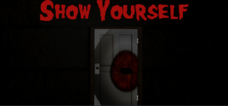
A psychological horror where Charlie will have to deal with his memories and his demons... but are they really demons? Who can Charlie trust? The flying brain or the mysterious voice? Every choice matters and will lead you to a different ending
$9.993 user reviews
AdventurePuzzleInteractive Fiction
WattyGamesMay 1, 2025