Scoring genre clarity...

Little Witch's Carnival capsule

Little Witch's Carnival

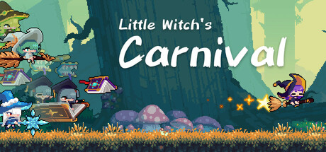
This is a light ROGUE game that combines weapon evolution and action shooting, with diverse builds and duels. Play as a young witch visiting school's club carnival. Defeat the overly enthusiastic members of various clubs and survive their crazy talent shows and fanatical recruitment efforts!

$4.99Positive(35)
Action RoguelikeActionBullet Hell
Kanata GameOct 22, 2025

Little Witch's Carnival scores 70/100 — better than 25% of Action Roguelike capsules (n=1,675).

Positive (35 reviews) · $4.99 · Released Oct 22, 2025 · By Kanata Game

Quick text summary

Little Witch's Carnival scored 70/100 on Steam Analyzer — Good for a Action Roguelike capsule. Top priority fix: [genre_clarity] Add a subtle visual hint of the rogue-like mechanic—such as a glowing weapon, stat icons, or layered witch pose suggesting action combat—to telegraph the action-shooting gameplay.

Capsule scores by dimension

  • Genre Clarity: 7/10 — Whimsical action with genre mixing. The capsule clearly signals a magic-themed action game through the witch character on the right in purple outfit and the carnival setting with colorful elements. However, at tiny size the rogue-like and weapon evolution mechanics are not visually apparent—it reads more as a lighthearted adventure or party game than an action roguelike, which may create slight expectation mismatch with the actual gameplay loop.
  • Title Readability: 8/10 — Clear, well-placed title text. The title 'Little Witch's Carnival' uses white text with good contrast against the teal-dark background in the upper-middle area. The script font for 'Carnival' maintains legibility even at small sizes, and the two-tier layout with 'Little Witch's' in regular weight keeps hierarchy clear. At tiny size the text remains readable due to solid contrast and strategic non-overlapping placement.
  • Contrast & Color: 8/10 — Strong value separation and pops. The capsule employs a warm-cool color strategy with teal-green backgrounds, cream sky, and vibrant purple/pink character accents that create clear separation against the Steam dark background #1b2838. The white title text and bright character silhouettes stand out distinctly, and the grayscale value range is well-distributed from dark teal to light yellow, maintaining silhouette clarity even at tiny thumbnail size.
  • Uniqueness & Polish: 6/10 — Charming but visually generic indie style. The pixel-art carnival scene feels competent and thematically cohesive with the game premise, but the art style is common in indie games and lacks a distinctive hook or visual selling point that sets it apart. The witch character design is appealing but not iconic, and the carnival elements feel more like a cheerful setting than a unique mechanical or narrative hook that would communicate what makes this rogue-like special compared to peers like Hades II.
  • Brand Consistency: 6/10 — Thematic cohesion without iconic signature. The capsule maintains internal consistency with pixel-art style, warm color palette, and carnival/magical theming that aligns with the game description. However, there are no obvious iconic character traits, signature visual motifs, or memorable brand marks that would make this capsule instantly recognizable if seen again—it relies on theme coherence rather than distinctive identity cues.
  • Composition: 7/10 — Balanced layout with clear focal points. The composition uses horizontal layering with carnival elements scattered across the ground plane, the witch character anchoring the right side, and title dominating the upper-center. The focal points are clear at full size, and the character silhouette reads well at small size. However, at tiny size some of the small carnival props (tents, decorations) blur together and lose individual emphasis, and the right-side character positioning leaves the left quarter somewhat empty, though the overall balance remains functional.

What works

  • Strong title contrast and readability. White text placement on dark teal background with strategic two-tier layout maintains legibility from full size down to tiny thumbnail.
  • Warm-cool color strategy pops against dark Steam background. Cream sky, vibrant purples, and pink accents create high value separation and silhouette clarity that draws attention in quick scroll.
  • Thematically coherent carnival setting. Pixel-art style, character pose, and festive elements clearly communicate the whimsical magical school carnival premise described in the game.

What hurts the capsule

  • Genre identity vague for roguelike action game. The carnival charm and soft aesthetic mask the core rogue-like weapon evolution and action combat mechanics, which are not visually hinted at in the capsule.
  • Generic indie pixel-art style lacks distinction. The art direction, while competent, does not establish a memorable brand identity or signature visual hook that would differentiate it from other colorful indie games in the storefront.
  • Small decorative elements lose clarity at tiny size. Carnival props and background details blur into noise at thumbnail scale, reducing the compositional richness that works well at full size.

Priority fixes

  1. [genre_clarity] Add a subtle visual hint of the rogue-like mechanic—such as a glowing weapon, stat icons, or layered witch pose suggesting action combat—to telegraph the action-shooting gameplay.
  2. [uniqueness_polish] Strengthen the witch character design with a more distinctive silhouette, color accent, or pose that creates an iconic brand signature visible even at tiny size.
  3. [composition] Rebalance the layout to reduce dead space on the left and anchor secondary carnival elements that maintain clarity as small supporting shapes rather than blurring into texture.

Store copy priority fixes

  1. [feature_communication] Add a concrete example of how weapon/build evolution works: 'Combine spells and upgrades to create new abilities—one run you may unlock rapid-fire projectiles, the next a protective shield that damages on contact.' This clarifies the build depth without requiring prior roguelike knowledge.
  2. [hook_strength] Rewrite the opening to lead with the action: 'Survive the chaos of a magical school carnival by dodging wild talent shows and outrageous club recruitment attacks—evolve your spells with each run to customize your playstyle.' This emphasizes the verb (survive/dodge) and the unique setting simultaneously.
  3. [uniqueness] Add explicit comparison or distinction: 'Unlike traditional roguelikes, every club and level is thematically tied to the carnival setting, creating a cohesive narrative wrapped around fast, arcade-style combat.' This helps players understand what sets it apart.
  4. [genre_clarity] Clarify bullet-hell mechanics in the detailed description: 'Navigate dense patterns of enemy attacks in real-time,' which is currently implied but never stated, ensuring players expecting bullet-hell gameplay know they will find it.

Related guides

Steam app ID: 3557270 · Tags: Action Roguelike, Action, Bullet Hell, Roguelite, Female Protagonist