Scoring genre clarity...

Pudding Frog capsule

Pudding Frog

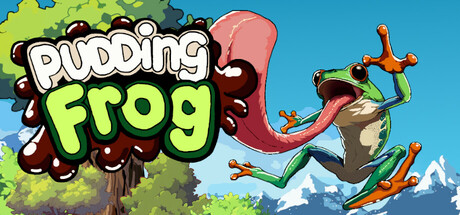
Dive into Pudding Frog, a high-stakes, physics-based platformer where every leap and grapple could be your last. Master the art of the swing as you painstakingly ascend through a treacherous world to reclaim your precious pudding from the cunning Harry the Heron. Do you have what it takes?

$5.997 user reviews
IndiePrecision Platformer2D Platformer
Big Head GamesApr 11, 2025

Pudding Frog scores 78/100 — better than 85% of Indie capsules (n=11,449).

7 user reviews · $5.99 · Released Apr 11, 2025 · By Big Head Games

Quick text summary

Pudding Frog scored 78/100 on Steam Analyzer — Good for a Indie capsule. Top priority fix: [genre_clarity] Add a subtle visual hint of the pudding or antagonist (heron) to reinforce the specific story context and differentiate from generic platformers

Capsule scores by dimension

  • Genre Clarity: 8/10 — Clear platformer action gameplay. The frog character mid-leap with exaggerated physics pose and grappling hook clearly communicates platformer mechanics. At tiny size, the action pose and bright character silhouette still read as dynamic movement-based gameplay, though the specific physics-swinging mechanic is not immediately obvious without context.
  • Title Readability: 9/10 — Bold, legible title design. The title "PUDDING FROG" uses a thick white outline and lime-green fill with a brown bubble/splat background that separates cleanly from the sky. At tiny size, the blocky letterforms and strong contrast maintain excellent readability, and the outline prevents letter collapse at small scales.
  • Contrast & Color: 8/10 — Strong value separation and saturation. The bright lime-green title and warm teal-blue sky create excellent contrast against the Steam dark background #1b2838. The orange frog and red grappling rope pop distinctly, and the character silhouette reads clearly in grayscale; however, the brown foliage in the upper left corner is slightly less separated in value.
  • Uniqueness & Polish: 7/10 — Charming, polished indie style. The art style is clean and purposeful with a cohesive cartoon aesthetic, bright saturated colors, and intentional character design that communicates personality and whimsy. The pudding/frog hook concept is thematic and memorable, though the overall presentation sits in a familiar indie platformer territory without a singular standout visual innovation.
  • Brand Consistency: 7/10 — Consistent color palette and character. The frog character, bright lime-green branding, and warm color palette (orange, teal, brown) appear consistent with the game's visual identity across available store imagery. The character design is recognizable and memorable, though the overall brand lacks a signature icon or motif beyond the frog itself that would make it instantly iconic.
  • Composition: 8/10 — Well-balanced focal hierarchy. The leaping frog occupies the center-right prime real estate with clear primary focus, while the title anchors the left side with supporting visual weight. The layered background (sky, foliage, mountains) creates depth, and the composition remains readable at small and tiny sizes; safe margins are respected, and no critical elements sit dangerously at edges.

What works

  • Readable title at all scales. The white outline and lime-green fill on a brown bubble background ensures the "PUDDING FROG" text stays legible even at tiny thumbnail size without collapsing.
  • Clear character-driven focal point. The mid-leap frog pose immediately communicates action and movement, making the platformer genre obvious and the character memorable and charming.
  • Vibrant color contrast. The bright palette of lime-green, orange, teal, and red pops strongly against the Steam dark background and maintains separation in grayscale conversion.
  • Cohesive art direction. Cartoon style, color choices, and character design feel intentional and unified, creating a polished indie presentation that avoids generic asset fatigue.

What hurts the capsule

  • Physics-swing mechanic unclear. While the pose hints at platforming action, the specific grapple-swing mechanic central to gameplay is not visually communicated in the capsule; only generic jumping is implied.
  • Upper-left foliage lacks contrast. The brown and dark green foliage in the top-left corner blends slightly against the background compared to other elements, reducing overall visual separation.
  • Generic pudding concept not visualized. The motivating goal (reclaiming pudding from Harry the Heron) is neither shown nor hinted at in the capsule, missing an opportunity to communicate unique narrative hook.

Priority fixes

  1. [genre_clarity] Add a subtle visual hint of the pudding or antagonist (heron) to reinforce the specific story context and differentiate from generic platformers
  2. [contrast_color] Increase brightness or saturation of the upper-left foliage to strengthen silhouette separation and balance visual weight
  3. [uniqueness_polish] Consider a signature logo or icon (e.g., stylized pudding or grapple-hook symbol) to elevate brand distinction beyond the frog alone

Store copy priority fixes

  1. [feature_communication] Expand the grappling mechanic description with concrete examples: e.g., 'swing from hooks to build momentum, timing your releases to land precise platforming challenges' instead of the abstract 'build tremendous speed.'
  2. [uniqueness] Add a specific comparison or contrast statement to clarify what makes this grapple system distinct: e.g., 'Unlike traditional grappling, momentum and physics allow multiple solutions to each puzzle' or 'Chain swings across gaps to generate the speed needed to reach inaccessible areas.'
  3. [hook_strength] Replace 'Dive into' with a verb that signals the core interaction: e.g., 'Swing through a treacherous world as Pudding Frog, a physics-based platformer where every grapple and leap could be your last.'

Related guides

Steam app ID: 3558570 · Tags: Indie, Precision Platformer, 2D Platformer, Difficult, Physics