Scoring genre clarity...
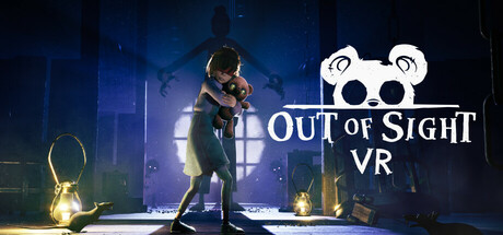
Out of Sight VR pulls you into a chilling nightmare where you see through the eyes of a child’s only comfort: her teddy bear. Guide Sophie through a sinister mansion and evade the lurking horrors that stalk her every move. The shadows are watching. And Sophie is counting on you.
$24.99Positive(45)
AdventurePuzzleExploration
Flat2VR Studios, The GangMay 22, 2025