Scoring genre clarity...
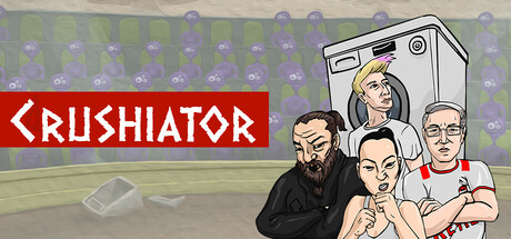
An experimental arena battle game! Choose from 4 unique characters, smash 6 breakable objects, and race against time. Play solo or challenge a friend in local split-screen multiplayer! Indie game, designed and developed by a solo creator.
$1.992 user reviews
ActionCasual2D Fighter
CarusApr 11, 2025