Scoring genre clarity...

Labyrinthine Dread capsule

Labyrinthine Dread

In this Top-Down Horror game, try to escape from an otherwise abandoned laboratory, armed only with a lantern and the keys strewn about in monster-infested rooms.

Free to PlayPositive(11)
CollectathonFemale Protagonist2D
Gamma Delta PiMay 2, 2025

Labyrinthine Dread scores 65/100 — better than 11% of Collectathon capsules (n=917).

Positive (11 reviews) · Free to Play · Released May 2, 2025 · By Gamma Delta Pi

Quick text summary

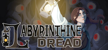
Labyrinthine Dread scored 65/100 on Steam Analyzer — Solid for a Collectathon capsule. Top priority fix: [composition] Remove or reposition red orbs to create stronger negative space and simplify the background, allowing the lantern and title to breathe more clearly at TINY size.

Capsule scores by dimension

  • Genre Clarity: 7/10 — Horror atmosphere clear, genre type ambiguous. The lantern, eerie red orbs, and dark laboratory setting strongly signal horror-adventure gameplay. However, at TINY size the top-down perspective is not immediately apparent, and the visual language reads more like narrative horror than action-mechanics horror. The girl's portrait and lantern motif communicate dread effectively but don't explicitly signal escape-puzzle or roguelike survival systems.
  • Title Readability: 6/10 — Title readable at full size, struggles tiny. The large white outlined text 'LABYRINTHINE DREAD' reads clearly at full and small sizes thanks to the strong outline and contrast against the dark background. However, at TINY size (120x45) the text becomes compressed and harder to distinguish individual letterforms, particularly the 'E' characters which may blur together. The outline weight is adequate but not exceptionally generous for ultra-small viewing.
  • Contrast & Color: 7/10 — Strong value separation with warm highlights. The bright lantern glow in the top-left creates excellent separation from the dark blue-gray laboratory background, and the red orb motifs add warm accent color that pops. The character portrait on the right maintains good silhouette definition against the shadowed area. In grayscale, the light sources read clearly, though the mid-tone brown character could benefit from sharper edge definition to fully separate from the dark surround.
  • Uniqueness & Polish: 6/10 — Competent horror aesthetic, generic execution. The lantern-in-darkness concept is a recognizable horror trope, and the girl's portrait adds character context. However, the design relies heavily on standard horror atmosphere rather than a distinctive visual hook or mechanic preview that differentiates it from other indie horror titles. The craft is clean but the overall composition feels like a standard genre template rather than a standout premium identity.
  • Brand Consistency: 6/10 — Cohesive horror palette, limited iconic markers. The dark blue and warm gold palette is internally consistent, and the lantern motif appears deliberate and thematic. Without seeing additional store assets, it is difficult to assess whether this lantern and color scheme form a recognizable brand signature across the game's visual suite. The current capsule lacks a distinctive character pose, symbol, or stylistic flourish that would create immediate brand recall.
  • Composition: 7/10 — Clear focal point, balanced but slightly cluttered. The lantern in the top-left and the girl's face on the right create a two-point hierarchy that guides the eye around the frame, while the title anchors the middle. At SMALL and TINY sizes the lantern remains the brightest focal point and reads well. However, the scattered red orbs in the background add visual texture that does not contribute meaningfully to hierarchy and slightly dilutes focus at compressed sizes; the composition would benefit from more intentional negative space.

What works

  • Strong lantern-light focal point. The bright glowing lantern in the top-left immediately draws attention and establishes the horror-adventure tone with a single memorable object.
  • Title outline ensures readability. The white outlined text 'LABYRINTHINE DREAD' maintains legibility across full and small sizes thanks to strong edge definition against the dark background.
  • Cohesive dark palette. The blue-gray laboratory tones and warm gold lantern glow create a unified, atmospheric color scheme that reinforces the horror mood consistently.

What hurts the capsule

  • Red orbs feel decorative and scattered. The background orbs add visual clutter without reinforcing the core mechanic or narrative hook, reducing composition clarity at smaller sizes.
  • Genre mechanics not visually implied. At TINY size, viewers cannot discern that this is a top-down escape-puzzle game; the visual language reads as narrative horror rather than systemic gameplay.
  • Character portrait lacks distinctive style. The girl's expression and art style are competent but do not communicate a unique brand identity or memorable character hook that would stand out versus other horror indies.

Priority fixes

  1. [composition] Remove or reposition red orbs to create stronger negative space and simplify the background, allowing the lantern and title to breathe more clearly at TINY size.
  2. [genre_clarity] Add a subtle visual cue such as a key, exit door, or room layout hint to signal the escape-puzzle mechanic without cluttering the design.
  3. [uniqueness_polish] Refine the character portrait with more expressive detail or a distinctive art style flourish to create a memorable brand signature that differentiates from generic horror competitors.
  4. [title_readability] Increase outline thickness on the title text by 1-2 pixels to ensure letter separation remains crisp at 120x45 thumbnail size.

Store copy priority fixes

  1. [audience_targeting] Clarify the 'Family Friendly' contradiction by either reframing tone as 'spooky but non-graphic,' removing the tag, or explaining in copy why it is appropriate for younger audiences.
  2. [uniqueness] Add a differentiating statement such as 'the only survival-horror game where your light source is both your weapon and your weakness' or specify what makes the chimaera encounters mechanically distinct.
  3. [feature_communication] Replace the three thematic bullet points with concrete gameplay features: e.g., 'Manage fuel consumption vs. monster detection,' 'Unlock new laboratory sections with collected key cards,' 'Piece together the lab's tragic history through optional lore notes.'
  4. [tone_match] Remove or rewrite 'the mind of Doctor Elizebeth Landrake' phrase and student-project disclosure to maintain atmospheric cohesion without breaking immersion.

Related guides

Steam app ID: 3560740 · Tags: Collectathon, Female Protagonist, 2D, Adventure, Top-Down