Scoring genre clarity...
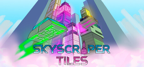
Build your city in Skyscraper Tiles and relax in that sandbox game without resource management! Stack soaring towers above the clouds and unleash fleets of flying vehicles. Craft your dream skyline and watch your futuristic metropolis come to life in the sky!
$3.99
CasualSandboxCity Builder
Super Voxel GamesJan 26, 2026