Scoring genre clarity...

THE WELL capsule

THE WELL

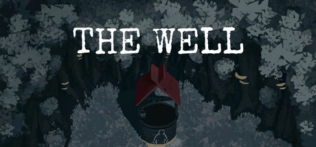
Isolation. Hopelessness. Starvation. By the will of an unknown force, you find yourself isolated from the outside world. Now you are doomed to starve to death. No one will come to your aid. No one will hear your prayers.

Free to PlayMostly Positive(54)
AdventureWalking SimulatorExploration
Creeps LTD., MarritDec 12, 2025

THE WELL scores 73/100 — better than 61% of Adventure capsules (n=7,922).

Mostly Positive (54 reviews) · Free to Play · Released Dec 12, 2025 · By Creeps LTD.

Quick text summary

THE WELL scored 73/100 on Steam Analyzer — Good for a Adventure capsule. Top priority fix: [uniqueness_polish] Introduce a distinctive visual element or character design detail that sets this capsule apart from other dark indie horror games—consider a unique silhouette shape or symbolic imagery specific to the well concept.

Capsule scores by dimension

  • Genre Clarity: 7/10 — Dark indie horror with isolation theme. The capsule clearly communicates a survival horror or psychological horror indie game through the distressed figure trapped in a well, deteriorating stone walls, and oppressive downward composition. The muted, desaturated palette and claustrophobic framing strongly suggest a dark, isolating experience. At TINY size, the central red figure and well opening remain readable enough to convey the core concept of being trapped, though finer environmental details blur.
  • Title Readability: 8/10 — Strong contrast serif title placement. THE WELL is rendered in white serif font with clear letter spacing and positioned in the upper safe zone against the darker stone texture background. The high value contrast between white text and the muted blue-gray background ensures legibility at FULL and SMALL sizes. At TINY size, the title remains recognizable despite slight blur, though individual letterforms lose sharpness—this is acceptable given the bold, widely-spaced design.
  • Contrast & Color: 8/10 — Strong value separation, clear focal subject. The red-robed figure creates excellent silhouette separation against the desaturated blue-gray stone walls, with warm-to-cool color contrast reinforcing the figure as focal point. The title's white letterforms pop cleanly from the background. At TINY and SMALL sizes, the red accent maintains visibility and draws the eye effectively even under quick scroll conditions, and grayscale conversion preserves the value hierarchy.
  • Uniqueness & Polish: 7/10 — Atmospheric but slightly templated dark indie. The capsule delivers strong atmospheric presentation with the weathered stone texture, downward perspective, and isolation theme that aligns well with indie horror trends. However, the execution feels closer to competent dark indie standard than distinctive breakthrough—comparable titles like DREDGE and ANIMAL WELL employ similar moody visual language. The red-robed figure is the strongest unique hook, but the overall composition and palette feel familiar within the genre.
  • Brand Consistency: 6/10 — Coherent atmosphere but limited identity. The capsule maintains internal visual cohesion with a unified desaturated palette, consistent stone texture work, and atmospheric lighting that would carry across store screenshots. However, there are no distinctive brand identity markers like a recognizable character design, symbolic motif, or signature art style that would allow this capsule to be recognized later independent of the title. The presentation is thematically consistent but generically dark indie.
  • Composition: 8/10 — Clear hierarchy, centered focal point, balanced. The composition uses strong depth layering with weathered stone background, mid-tone walls, and the red-robed figure in the center-lower foreground, creating clear visual hierarchy. The title anchors the top safely within margins, and the central figure draws the eye downward naturally. At SMALL and TINY sizes, the focal point remains unmistakable and the composition doesn't collapse, though at TINY the figure loses some dimensional clarity in the stone texture.

What works

  • Title contrast and placement. White serif text positioned in the upper safe zone maintains excellent readability at all sizes and doesn't compete with the focal image.
  • Color accent for focal subject. The red-robed figure creates strong visual separation from the desaturated background and remains the clear primary subject even at TINY size.
  • Atmospheric mood communication. The downward composition, deteriorating stone walls, and isolation imagery effectively communicate the game's core theme of hopelessness and entrapment.

What hurts the capsule

  • Limited distinctive brand identity. The capsule lacks memorable character design or iconic visual motif that would allow recognition beyond the title alone, relying on generic dark indie aesthetic.
  • Texture detail loss at small sizes. The weathered stone and surface details that create atmosphere at full size blur into muddy gray at TINY size, reducing perceived craft and detail.
  • Compositional familiarity in genre. The downward-facing figure in a stone environment echoes multiple existing indie horror titles like DREDGE, making the visual hook feel derivative rather than fresh.

Priority fixes

  1. [uniqueness_polish] Introduce a distinctive visual element or character design detail that sets this capsule apart from other dark indie horror games—consider a unique silhouette shape or symbolic imagery specific to the well concept.
  2. [brand_consistency] Establish a signature visual motif or color accent beyond the red robe that could appear consistently across store screenshots and create an iconic identity.
  3. [contrast_color] Sharpen the mid-tone stone texture contrast or add subtle atmospheric lighting effects that maintain visual interest and surface clarity at SMALL size without creating noise.

Store copy priority fixes

  1. [hook_strength] Rewrite the short description to lead with the corpse discovery or the mechanic of following a dead woman's orders; replace 'By the will of an unknown force' with a concrete hook that hints at the game's twisted core interaction.
  2. [feature_communication] Add a one-sentence mechanical hook immediately after the atmosphere paragraph, e.g., 'Obeying a corpse pulled from your well, you must hunt the forest's horrors to survive—but the line between sanity and servitude blurs with each day.'
  3. [uniqueness] Explicitly articulate what separates this game in a new sentence, e.g., 'Unlike typical psychological horror, your only guide is a corpse whose orders grow stranger as your environment decays—merging exploration, moral choice, and survival into a single descent.'
  4. [audience_targeting] Add one sentence clarifying tone and player type, e.g., 'Best for players who value atmospheric dread and narrative discovery over action; 30 minutes of intimate, unsettling exploration.'

Related guides

Steam app ID: 3563780 · Tags: Adventure, Walking Simulator, Exploration, Hidden Object, 3D