Scoring genre clarity...
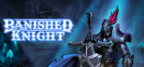
The 'Banished Knight' is a 3D top-down action Roguelike game. The story takes place after Ragnarok, where the player, as a heroic knight, must travel to Svartalfheim to battle various types of monsters, collect resources, unlock new weapons,and repair the Valkyrie statue.
$3.99Positive(20)
AdventureAction RoguelikeRPG
Moss StudioJan 31, 2026