Scoring genre clarity...

Iron Onslaught capsule

Iron Onslaught

Sit back, relax, and survive the endless wave of bots and mechs.

$1.991 user reviews
ActionStrategy3D Fighter
Saudade SoftwareApr 10, 2025

Iron Onslaught scores 68/100 — better than 17% of Action capsules (n=8,534).

1 user reviews · $1.99 · Released Apr 10, 2025 · By Saudade Software

Quick text summary

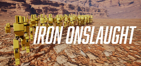
Iron Onslaught scored 68/100 on Steam Analyzer — Solid for a Action capsule. Top priority fix: [uniqueness_polish] Introduce a distinctive visual hook—such as a unique mech design element, iconic color accent, or visual storytelling moment (e.g., explosion, impact, or unit formation) that signals 'Iron Onslaught' specifically rather than generic mecha.

Capsule scores by dimension

  • Genre Clarity: 7/10 — Mech action strategy reads clearly. The yellow industrial mechs and desolate terrain immediately signal a sci-fi action-strategy game with tower defense or wave survival mechanics. At TINY size, the blocky mech silhouettes and barren landscape remain recognizable, though the specific 'endless wave' survival mechanic is not immediately obvious from visuals alone. The composition successfully avoids ambiguity about the core action genre.
  • Title Readability: 8/10 — Strong legible title with good contrast. IRON ONSLAUGHT is rendered in bold white sans-serif text with clean letterforms that maintain readability at SMALL and TINY sizes against the warm-brown desert background. The title sits in a controlled mid-composition zone away from busy texture, and the lack of decorative effects preserves clarity at all viewing scales. Letter spacing is generous and the horizontal emphasis suits the wide capsule format.
  • Contrast & Color: 7/10 — Good value separation with warm palette. The bright yellow mechs and white title create strong contrast against the warm brown and tan desert tones, which themselves have decent separation from the Steam dark background. At TINY size, the yellow mech cluster reads as a distinct silhouette due to its saturation and brightness. The grayscale silhouette remains solid, though the mid-tone desert textures could be sharper in value separation from shadows.
  • Uniqueness & Polish: 6/10 — Competent sci-fi aesthetic, somewhat generic. The presentation is clean and professional with a cohesive sci-fi industrial theme, but the desolate desert-with-mechs visual is familiar territory in the mecha and strategy genres—similar setups appear in numerous indie and AAA titles. The yellow color choice for the mechs is distinctive and readable, but the overall composition lacks a signature visual hook or storytelling moment that sets it apart from comparable action-strategy games like Armored Core or HELLDIVERS 2.
  • Brand Consistency: 6/10 — Consistent color scheme, limited identity cues. The yellow-and-industrial aesthetic is consistent across the capsule, and the bold sans-serif typography suggests a clean brand identity aligned with the sci-fi theme. However, there are no distinctive character, symbol, or signature motif visible that would make this capsule immediately recognizable in isolation—the visual language is functional but not iconic or memorable enough to stand alone without the title.
  • Composition: 7/10 — Clear hierarchy with mech focal point. The yellow mech cluster in the upper-left to center area creates a clear primary focal point, with the title positioned to the right in a balanced arrangement that guides eye flow naturally. The deep desert background provides depth context without competing for attention. At TINY size, the composition remains coherent with the mech mass and title text both readable, though the empty lower-right quadrant represents mild wasted space that could reinforce subject dominance.

What works

  • Title legibility at all sizes. IRON ONSLAUGHT maintains excellent readability from full header down to tiny thumbnail due to high contrast, clean typography, and strategic placement away from busy texture.
  • Clear genre communication. Mech silhouettes and desolate sci-fi setting immediately signal action-strategy gameplay without ambiguity or mixed messaging.
  • Strong primary focal point. Yellow mech cluster dominates visual attention and remains a distinct silhouette even at smallest viewing size due to saturation and brightness.
  • Coherent color palette. Warm desert tones and bright yellow/white accents create an internally consistent sci-fi industrial aesthetic with good contrast against the dark Steam background.

What hurts the capsule

  • Generic visual concept. Desert mechs are a familiar aesthetic in action-strategy genre and lack a distinctive visual hook that differentiates from comparable AAA and indie titles.
  • Weak brand identity signal. No iconic character, symbol, or signature motif provides memorability or recognition cues—the capsule could be replaced by similar games without clear identity loss.
  • Underutilized composition space. Lower-right quadrant is largely empty desert with minimal focal point contribution, representing missed opportunity for secondary visual interest or brand reinforcement.

Priority fixes

  1. [uniqueness_polish] Introduce a distinctive visual hook—such as a unique mech design element, iconic color accent, or visual storytelling moment (e.g., explosion, impact, or unit formation) that signals 'Iron Onslaught' specifically rather than generic mecha.
  2. [brand_consistency] Add a recognizable symbol, emblem, or signature design motif (e.g., faction logo, unit insignia, or stylized pattern) in the lower-right safe zone to reinforce brand identity and memorability across marketing materials.
  3. [composition] Consider rebalancing the layout to reduce empty space and create secondary focal points in the lower-right area through environmental detail, additional unit silhouettes, or contextual UI elements that hint at the wave survival mechanic.

Store copy priority fixes

  1. [hook_strength] Rewrite the short description to lead with action and tension—e.g., 'Face an endless barrage of bots and mechs, unlocking weapons on the fly or face annihilation' instead of 'sit back, relax.'
  2. [uniqueness] Add a sentence explaining what is mechanically distinct about Iron Onslaught—e.g., specific weapon types, unique enemy patterns, or a leaderboard meta that sets it apart from other wave-based shooters.
  3. [tone_match] Align the copy's tone with the game's actual difficulty and permadeath stakes by removing or reframing the 'relax' language to appeal to skill-driven, hardcore players.
  4. [feature_communication] Add brief detail about weapon variety and visual/audio atmosphere to help players understand the sensory experience and long-term replayability.

Related guides

Steam app ID: 3569050 · Tags: Action, Strategy, 3D Fighter, Beat 'em up, Shooter