Scoring genre clarity...
Scoring genre clarity...
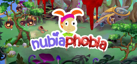
NubiaPhobia scores 65/100 — better than 11% of Adventure capsules (n=8,544).
6 user reviews · $2.39 · Released Oct 10, 2025 · By Tonguç Bodur
NubiaPhobia scored 65/100 on Steam Analyzer — Solid for a Adventure capsule. Top priority fix: [genre_clarity] Reposition or emphasize the bunny character as the clear protagonist focal point and add subtle UI puzzle elements (magnifying glass, locked chest icon) to communicate the point-and-click puzzle mechanic.
Steam app ID: 3570040 · Tags: Adventure, Point & Click, Puzzle, Dark Humor, Funny