CARIMARA: Beneath the forlorn limbs scores 77/100 — better than 84% of Story Rich capsules (n=3,563).

Quick text summary

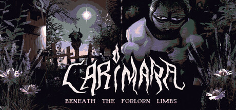
CARIMARA: Beneath the forlorn limbs scored 77/100 on Steam Analyzer — Good for a Story Rich capsule. Top priority fix: [title_readability] Replace or simplify the decorative metal font with a cleaner, bolder sans-serif that maintains the gothic aesthetic but preserves legibility at TINY size—test at 120×45 to ensure letterforms remain distinct.

Capsule scores by dimension

  • Genre Clarity: 8/10 — Dark adventure horror atmosphere clear. The capsule effectively signals a supernatural horror-adventure through the eerie nighttime forest setting, gnarled trees, full moon, and a menacing pale figure with an unsettling grin. At TINY size, the dark silhouettes and haunting composition still read as 'creepy exploration game' despite fine details collapsing. The visual language aligns well with indie psychological adventure expectations.
  • Title Readability: 7/10 — Metal font readable but risky small. The CARIMARA title uses a stylized metal/horror font with decent contrast against the dark forest background at full size, but the decorative serifs and irregular letterforms lose crispness at SMALL size and become somewhat blurry at TINY. The subtitle 'BENEATH THE FORLORN LIMBS' is legible at full size but effectively disappears at TINY, requiring upscaling to read. The title placement on mid-tone forest area is strategic but not ideal for extreme shrinkage.
  • Contrast & Color: 8/10 — Strong silhouette separation and depth. The pale cream and lavender tones of the central figure create excellent value separation against the deep black forest and dark sky, reading clearly even at TINY size. The glowing moon provides a secondary bright anchor. Grayscale conversion maintains strong contrast with clear silhouettes, though the title's dark outline requires the decorative font to avoid complete loss. Overall, the dark-to-light hierarchy pops well against Steam's #1b2838 background.
  • Uniqueness & Polish: 8/10 — Distinctive horror aesthetic cohesive. The capsule demonstrates intentional craft with a coherent unsettling art direction—the gnarled forest, eerie figure design, and glow effects work together to communicate a unique atmospheric experience rather than a generic adventure. The visual storytelling hints at the game's core appeal: supernatural mystery and dread. The execution feels premium compared to template horror art, though it operates within expected indie horror conventions.
  • Brand Consistency: 7/10 — Recognizable dark aesthetic identity. The capsule establishes a consistent visual identity through its signature dark forest palette, pale figure character, and gothic metal typography. The supernatural figure and creeping-horror atmosphere are likely recognizable across store screenshots based on the distinctive silhouette and color language. However, the brand identity is well-executed but not iconically unique—similar visual language appears in other dark indie games, so while internally cohesive, it lacks a truly signature visual hook.
  • Composition: 8/10 — Clear focal hierarchy with depth. The central pale figure commands attention as the primary focal point, with the moon and forest creating layered depth (background, midground, foreground). The title sits cleanly at the bottom in a controlled band, not competing with the figure. Safe margins are respected, and the composition remains legible at SMALL and TINY sizes without critical crop loss. The symmetrical balance and vertical orientation work well at multiple scales.

What works

  • Strong contrast against dark background. The pale figure and moon glow provide excellent value separation that reads clearly even at TINY size and pops well against Steam's #1b2838 interface.
  • Atmospheric genre signaling. The eerie forest setting, full moon, twisted trees, and unsettling figure immediately communicate dark adventure horror without confusion at all sizes.
  • Coherent visual art direction. The gothic palette, character design, and environmental details feel intentionally crafted and cohesive rather than generic or templated.
  • Effective composition hierarchy. Clear focal point on the central figure with good depth layering and title placement that doesn't interfere with the primary visual story.

What hurts the capsule

  • Title legibility degrades at TINY. The decorative metal font letterforms lose definition and become blurry at extremely small sizes, risking quick-scroll readability.
  • Subtitle becomes unreadable small. 'BENEATH THE FORLORN LIMBS' is invisible at TINY size and requires significant scaling, losing secondary messaging impact.
  • Font style prioritizes aesthetics over clarity. The horror-themed seriffed metal lettering looks atmospheric but sacrifices the legibility margin that would keep it readable at all scales.
  • Generic within dark horror subgenre. While well-executed, the eerie forest and pale figure aesthetic is recognizable but not uniquely distinctive compared to similar indie horror titles.

Priority fixes

  1. [title_readability] Replace or simplify the decorative metal font with a cleaner, bolder sans-serif that maintains the gothic aesthetic but preserves legibility at TINY size—test at 120×45 to ensure letterforms remain distinct.
  2. [title_readability] Remove or significantly enlarge the subtitle 'BENEATH THE FORLORN LIMBS' so it remains legible at SMALL size, or accept it as decorative-only and use that space to strengthen the main title.
  3. [uniqueness_polish] Increase the distinctive visual signature by enhancing the pale figure's unique design details or adding a recognizable symbolic element (sigil, pattern, or pose) that would become iconic across store pages.

Store copy priority fixes

  1. [feature_communication] Add a single clear sentence early in the detailed description explaining the core mechanic: 'You ask questions through glyphs on cards, and the house responds—but some answers carry consequences.' This grounds the poetic language in actionable gameplay.
  2. [feature_communication] Include session length explicitly: 'A 90-minute exploration' or similar, so players know scope upfront without guessing from 'short experience.'
  3. [genre_clarity] Clarify the walking simulator + puzzle loop in the opening paragraph: 'Explore a haunted house, find objects that trigger memories, ask questions that unlock secrets—but choose your questions carefully.' This bridges poetry and mechanics.
  4. [audience_targeting] Add a one-sentence audience signal after the main hook, such as: 'Perfect for players who love atmospheric mysteries and narrative-driven exploration over action' to pre-filter effectively.

Related guides

Steam app ID: 3570370 · Tags: Story Rich, Mystery, Exploration, Adventure, Horror