There's Chaos! scores 68/100 — better than 14% of Action Roguelike capsules (n=1,675).

Quick text summary

There's Chaos! scored 68/100 on Steam Analyzer — Solid for a Action Roguelike capsule. Top priority fix: [uniqueness_polish] Incorporate a visual element that communicates the weapon fusion or roguelike mechanic—such as glowing energy vortex around the drone or stacked weapon icons—to differentiate from generic action capsules.

Capsule scores by dimension

  • Genre Clarity: 7/10 — Clear action game, drone piloting evident. The deconstructed combat drone in the center immediately signals action and mecha-style gameplay. Scattered weapon parts and the explosion effect reinforce a chaotic, combat-focused theme. At TINY size, the drone silhouette and weapons remain readable enough to communicate 'action game,' though the specific roguelike progression mechanic is not visually apparent.
  • Title Readability: 8/10 — Strong white text, excellent contrast. The title 'There's Chaos!' uses bold white sans-serif text with a clean drop shadow, positioned in the lower third against a neutral beige background. At SMALL and TINY sizes, the text remains legible and the exclamation mark reinforces the energetic tone. The placement avoids the drone entirely, ensuring no overlap or collision with visual elements.
  • Contrast & Color: 7/10 — Good value separation, clean silhouettes. The white drone against the warm beige-gray background creates clear contrast, and the scattered weapon parts maintain distinct edges. The white title pops well against the neutral background. At TINY size, the drone and weapons read as cohesive mechanical shapes, though some fine detail on the parts becomes less distinct in grayscale.
  • Uniqueness & Polish: 6/10 — Competent but generic action presentation. The image shows a functional 3D render of a combat drone with professional lighting and clean shadows, but the presentation feels like a standard product showcase rather than a distinctive game hook. The scattered weapons and explosion effect are competent visual storytelling for 'action game,' but do not communicate the unique roguelike fusion mechanic or the specific identity that would set it apart from similar action titles. Compared to top-performing genre peers like Helldivers 2 or Armored Core VI, the capsule lacks a memorable visual signature or striking art direction.
  • Brand Consistency: 6/10 — Clean render, lacks memorable identity. The drone design is rendered consistently and the overall aesthetic is cohesive, with matching lighting and material treatment across all elements. However, there are no iconic visual motifs, signature colors, or distinctive UI elements that would create a recognizable brand identity. Without reference to the other 9 store screenshots, this capsule alone does not establish a memorable visual brand that would be immediately recognizable in a later encounter.
  • Composition: 7/10 — Strong focal point, balanced layout. The deconstructed drone occupies the center-upper area as the primary focal point, with scattered weapon parts radiating outward to create a sense of chaos and motion. The title anchors the bottom third, leaving safe margins from edges. The composition scales well to SMALL and TINY sizes, with the drone remaining the clear subject, though the explosion effect adds visual energy without overwhelming the read.

What works

  • Readable title with strong contrast. White text with drop shadow pops clearly against the neutral background and remains legible at TINY size.
  • Clear central focal point. The drone silhouette is immediately recognizable as the primary subject and scales well across all viewing sizes.
  • Professional 3D rendering quality. Lighting, shadows, and material treatment are clean and cohesive throughout the image.

What hurts the capsule

  • Generic action game presentation. The capsule does not visually communicate the unique roguelike progression, weapon fusion mechanic, or what makes 'There's Chaos!' distinct from other action games.
  • Weak brand identity and memorable hooks. No signature color palette, iconic motif, or UI element that would make the game recognizable or distinctive compared to genre peers.
  • Explosion effect adds visual clutter. The right-side explosion, while energetic, competes with the drone for attention and becomes muddier at smaller sizes.

Priority fixes

  1. [uniqueness_polish] Incorporate a visual element that communicates the weapon fusion or roguelike mechanic—such as glowing energy vortex around the drone or stacked weapon icons—to differentiate from generic action capsules.
  2. [brand_consistency] Add a signature color accent (warm orange or electric blue) that appears consistently in the drone design or background to establish a memorable visual brand.
  3. [contrast_color] Reduce or stylize the explosion effect on the right to minimize competition with the drone focal point and improve clarity at TINY size.

Store copy priority fixes

  1. [hook_strength] Rewrite the short description opening to lead with the core unique mechanic: 'Pilot an upgradeable combat drone by collecting and fusing enemy weapons in intense 30-minute roguelike battles' instead of '
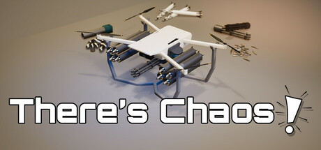
An action-packed game with roguelike progression.'
  2. [feature_communication] Expand the detailed description to explain weapon fusion concretely: 'Collect defeated enemy weapons and fuse them together to create custom loadouts—each fusion unlocks new effects and playstyles' to help players mentally model the mechanic.
  3. [audience_targeting] Add a sentence clarifying the difficulty and accessibility level, especially given the Casual tag: 'Accessible controls make quick runs enjoyable for all skill levels, while deep fusion systems reward mastery' or similar.
  4. [uniqueness] Add a concrete comparison or claim that differentiates this game: 'Unlike other roguelikes, weapon fusion gives you direct control over your loadout progression' to explain why this matters.

Related guides

Steam app ID: 3571540 · Tags: Action Roguelike, Flight, Arena Shooter, Bullet Hell, FPS