Scoring genre clarity...

Mystic Jumper capsule

Mystic Jumper

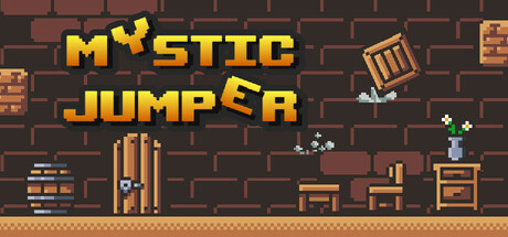
A clumsy wizard turns into random objects and must triple-jump up his tower! Conquer 60 handcrafted levels of precise platforming, traps, and unique physics in retro pixel art. Hard Mode offers a true rage challenge, while Easy lets you enjoy the flow—every climb is a beautiful journey.

$2.992 user reviews
2D PlatformerPlatformerCasual
GVS sp. z o. o.Oct 24, 2025

Mystic Jumper scores 77/100 — better than 79% of 2D Platformer capsules (n=1,970).

2 user reviews · $2.99 · Released Oct 24, 2025 · By GVS sp. z o. o.

Quick text summary

Mystic Jumper scored 77/100 on Steam Analyzer — Good for a 2D Platformer capsule. Top priority fix: [uniqueness_polish] Emphasize the shape-shifting mechanic visually by adding a subtle transformation effect or additional object forms in the scene to differentiate from generic platformers

Capsule scores by dimension

  • Genre Clarity: 8/10 — Platformer with magical charm clear. The pixel art wizard character, tower setting with furniture obstacles, and upward-focused composition immediately signal a platformer. The retro aesthetic and magical elements (glowing effects, wizard silhouette) reinforce the casual indie platformer genre. At tiny size, the character and vertical tower structure remain readable enough to communicate platforming gameplay, though fine detail of the wizard's form softens.
  • Title Readability: 8/10 — Bold yellow text reads cleanly. The title 'MYSTIC JUMPER' uses a thick, blocky yellow bitmap font with strong contrast against the dark brick background, maintaining excellent legibility at small and tiny sizes. The all-caps treatment and consistent letterform weight prevent collapse at reduced scales. At tiny size the text remains identifiable, though individual letter clarity diminishes slightly.
  • Contrast & Color: 8/10 — Warm palette pops against dark. The warm orange and yellow tones (title, furniture, character accents) create strong value separation against the cool dark brick background and Steam's #1b2838 context. The pixel art rendering with crisp edges maintains silhouette clarity even at small sizes, and the grayscale test shows solid dark-to-light distinction. The subtle glowing effects on wizard elements add depth without muddying readability.
  • Uniqueness & Polish: 7/10 — Charming retro style, slight genericism. The capsule demonstrates solid pixel art craft with intentional character design (wizard figure), clear level architecture, and cohesive retro aesthetic that feels premium for the indie space. The concept of a shape-shifting wizard climbing is a distinctive hook, but the execution relies heavily on familiar platformer tropes and generic tower/castle interior setting. The visual storytelling is clear but not immediately memorable beyond the theme.
  • Brand Consistency: 7/10 — Consistent retro pixel identity. The capsule establishes a recognizable identity through consistent pixel art rendering, warm earth-tone palette (oranges, browns, tans), and the distinctive wizard character design that would likely carry through store screenshots. The retro aesthetic is cohesive and intentional, though without a unique color signature or iconic motif that sets it apart from other pixel art platformers. The blocky typography and sprite style reinforce internal consistency.
  • Composition: 8/10 — Strong vertical hierarchy, balanced layout. The composition uses vertical orientation to emphasize upward progression, with the title dominating the top third and the wizard/tower scene anchoring the center-right focal point. Supporting furniture elements are distributed without clutter, creating depth through layering (background brick, mid-ground furniture, foreground character). At tiny size, the vertical structure remains clear, though some small furniture details fade; title placement is safe from Steam cropping and the overall balance prevents dead zones.

What works

  • Title contrast and legibility. Bold yellow bitmap font maintains excellent readability even at tiny size against the dark brick background.
  • Vertical composition reinforces genre. The upward-focused tower layout immediately communicates platformer progression and climbing challenge.
  • Warm palette pops distinctly. Orange and yellow tones create strong visual separation from Steam's dark background without oversaturation.
  • Consistent pixel art polish. Sprite rendering and level details feel intentionally crafted rather than assembled from asset packs.

What hurts the capsule

  • Limited visual uniqueness. The tower interior setting and generic furniture feel familiar to similar platformers without a standout visual hook.
  • Small detail clarity at tiny size. Fine character animation and glowing effects soften at reduced scales, losing some of the wizard's personality.
  • No iconic brand motif. While the art is cohesive, there's no signature symbol or character pose that would be immediately recognizable across promotional materials.

Priority fixes

  1. [uniqueness_polish] Emphasize the shape-shifting mechanic visually by adding a subtle transformation effect or additional object forms in the scene to differentiate from generic platformers
  2. [brand_consistency] Introduce a distinctive color accent or wizard-specific visual element that becomes a recognizable brand marker across all promotional materials
  3. [composition] Ensure the wizard character has a more dynamic pose or gesture that communicates action and personality even at tiny thumbnail size

Store copy priority fixes

  1. [feature_communication] Expand the Object Transformation bullet with a concrete example: 'Play as different objects (crate, chair, barrel) with unique physics—heavier objects fall faster, lighter ones are more agile.'
  2. [audience_targeting] Add one sentence signaling family-friendly appeal: 'Perfect for platformer fans of all ages, with Easy Mode letting younger or casual players progress at their own pace.'
  3. [tone_match] Remove or reframe the motivational affirmation paragraph ('Get excited by overcoming obstacles...') to focus on gameplay outcomes rather than emotional validation, or integrate it into the mode descriptions.
  4. [uniqueness] Strengthen the uniqueness statement by clarifying what the triple-jump system does differently than standard double-jumps in other platformers.

Related guides

Steam app ID: 3571640 · Tags: 2D Platformer, Platformer, Casual, Pixel Graphics, 1990's