Scoring genre clarity...
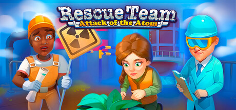
The world is on the edge of disaster, and it’s down to you to step in and save the day, again! You’ll join a team of familiar faces to lead the effort to uncover the scope of the issue and guide humanity to a safer and greener future!
$6.99Positive(11)
CasualAdventureStrategy
Game MixerMar 21, 2025