Scoring genre clarity...
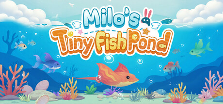
Create a vibrant, personal fish pond right on your desktop! Easily raise idle fish, collect cute species, and customize your digital space. Earn continuous rewards even while offline, decorate freely with simple taps and soothing sounds, build your serene desktop oasis effortlessly.
$2.49Positive(42)
CasualSimulationIdler
MMUnitApr 22, 2025