Scoring genre clarity...

Red Land capsule

Red Land

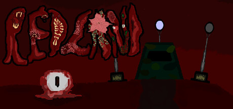
Escape a post-apocalyptic Earth colonized by a highly-intelligent alien species. Fight alien bosses, nitro-mutants, unlock classes, and explore dangerous biomes in a vast open world. Red Land is a rogue-lite, high risk, high reward game. Will you escape... or not?

$2.992 user reviews
Action RoguelikeExplorationRoguelite
Vladimir StepanovOct 11, 2025

Red Land scores 62/100 — better than 2% of Action Roguelike capsules (n=1,675).

2 user reviews · $2.99 · Released Oct 11, 2025 · By Vladimir Stepanov

Quick text summary

Red Land scored 62/100 on Steam Analyzer — Solid for a Action Roguelike capsule. Top priority fix: [title_readability] Redesign title with a bold, all-caps geometric or sans-serif lockup that remains legible at 120x45px; retain the red drip aesthetic as an accent beneath rather than embedded in letterforms

Capsule scores by dimension

  • Genre Clarity: 7/10 — Post-apocalyptic action, alien threat clear. The red dystopian landscape, alien silhouettes on the right, and hostile color palette immediately signal post-apocalyptic action-adventure. At TINY size, the alien forms and weapons are still recognizable, though fine details of the mutant creatures blur into abstraction. The genre reads as survival-action without ambiguity.
  • Title Readability: 5/10 — Title legible at full size, fails tiny. The word RED LAND in stylized letter-forms is readable at full header size with good letter separation, but at TINY size (120x45) the individual letters collapse into an illegible red smear. The organic, dripping letterforms sacrifice clarity for thematic atmosphere, making recovery at small scales difficult. A secondary readable lockup would significantly improve discoverability.
  • Contrast & Color: 7/10 — Strong red-dark separation, muddy midtones. The crimson and burgundy title and creature forms contrast sharply against the dark maroon background, creating silhouette separation that holds at SMALL size. However, the mid-tone oranges in the creature details and internal glow effects blend somewhat into the background when squinting, softening the edge clarity. Overall contrast is above baseline but not exceptional for quick-scroll recognition.
  • Uniqueness & Polish: 6/10 — Thematic consistency, generic alien execution. The red-on-dark aesthetic is visually coherent and thematically appropriate for post-apocalyptic alienscape, with the title letterforms and creature designs sharing an organic, corrupted aesthetic. However, the alien silhouettes and environmental elements feel archetypal rather than distinctive—similar shapes appear across many sci-fi horror titles. The craft is competent but lacks a memorable visual hook that would differentiate Red Land from other post-apocalyptic action games.
  • Brand Consistency: 6/10 — Coherent red palette, no iconic motif. The capsule maintains consistent color grading (deep reds, dark backgrounds) and a unified grotesque aesthetic across the title and creature designs. However, there are no clearly recognizable brand icons, character silhouettes, or signature visual motifs that would allow a returning player to identify Red Land from memory alone. The style is internally cohesive but not distinctly branded.
  • Composition: 6/10 — Balanced layout, competing focal points. The title occupies the left-center region with good weight, while alien forms and objects spread across the right side creating visual balance. However, at TINY size the layout fragments—the title becomes illegible, and the alien structures on the right lose definition, leaving no clear primary focal point. The composition works at full size but lacks resilience to aggressive scaling; key elements should be consolidated for better thumbnail hierarchy.

What works

  • Thematic color palette unity. The red-burgundy-maroon gradient creates a cohesive dystopian mood that immediately communicates the post-apocalyptic setting.
  • Silhouette contrast at small size. Alien forms and environmental props maintain recognizable outlines against the dark background even when squinting, preserving genre clarity.
  • Atmospheric letterform design. The organic, dripping title styling reinforces the alien corruption theme and feels intentional rather than generic.

What hurts the capsule

  • Title illegibility at tiny size. The stylized RED LAND letterforms collapse into an unreadable blur below 231px width, severely harming discoverability in browse lists.
  • Lack of iconic brand identity. No memorable character, symbol, or visual motif exists to create lasting brand recognition or differentiation in the crowded post-apocalyptic action genre.
  • Muddy midtone detail blending. Orange glows and creature internal details merge with background tones, softening edge clarity and reducing visual impact during quick scrolls.

Priority fixes

  1. [title_readability] Redesign title with a bold, all-caps geometric or sans-serif lockup that remains legible at 120x45px; retain the red drip aesthetic as an accent beneath rather than embedded in letterforms
  2. [uniqueness_polish] Introduce a signature visual motif—a distinctive alien design, weapon, or environmental prop—that serves as an iconic identifier for Red Land across marketing materials
  3. [composition] Consolidate the focal point by anchoring the title and a single key alien form (center-left) to create clear hierarchy at SMALL size, relegating secondary details to the edges
  4. [contrast_color] Increase value separation in creature glow effects by using brighter oranges or pinks that push further away from the burgundy background, especially in silhouette regions

Store copy priority fixes

  1. [hook_strength] Replace 'Will you escape... or not?' with a concrete promise tied to a unique mechanic, e.g., 'Will you harness forbidden alien tech and escape, or perish like the rest of humanity?' to amplify stakes and hint at differentiation.
  2. [uniqueness] Add a sentence explicitly contrasting Red Land's resource or progression systems against standard roguelikes, such as 'Unlike typical roguelikes, you rely on unpredictable slot machines and alien Aura currencies—not gold' to establish clear differentiation.
  3. [feature_communication] Consolidate the bulleted mechanic list with consistent detail levels: clarify how hunger, sleep, and fatigue interact as a survival system, as these currently feel scattered and underexplained.
  4. [audience_targeting] Add a sentence signaling difficulty and accessibility, e.g., 'Designed for roguelike veterans and newcomers alike, with adjustable difficulty and no timed input required,' to help the right players self-identify early.

Related guides

Steam app ID: 3573990 · Tags: Action Roguelike, Exploration, Roguelite, PvE, Roguelike