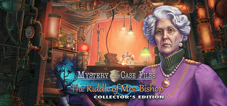
Mystery Case Files: The Riddle of Mrs. Bishop Collector's Edition scores 70/100 — better than 28% of Casual capsules (n=10,512).
Positive (23 reviews) · $19.99 · Released Mar 10, 2025 · By Grandma Studios
Mystery Case Files: The Riddle of Mrs. Bishop Collector's Edition scored 70/100 on Steam Analyzer — Good for a Casual capsule. Top priority fix: [genre_clarity] Add subtle hidden object visual cue—such as a magnifying glass highlight, circled detail, or investigative UI element—to clarify this is a hidden object adventure game rather than generic period drama.
Steam app ID: 3575430 · Tags: Casual, Adventure, Hidden Object, Point & Click, Detective