Quick text summary
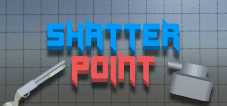
Shatter Point scored 70/100 on Steam Analyzer — Good for a Action capsule. Top priority fix: [genre_clarity] Replace generic wrench and toolbox with a dynamic visual cue tied to grappling or movement—such as a stylized character in mid-grapple, rope/hook element, or motion trail that communicates the core mechanic.
Capsule scores by dimension
- Genre Clarity: 7/10 — FPS action clearly signaled. The bold blue and red typography with industrial 3D block letters immediately suggests action and energy. The wrench and toolbox elements in the background hint at destruction or crafting mechanics, supporting an action game identity. At tiny size the blocky letterforms and warm-cool color contrast still read as action-oriented, though the specific FPS mechanic (grappling, movement) is not visually obvious without context.
- Title Readability: 8/10 — Strong legibility across all sizes. SHATTER POINT uses clean, bold geometric sans-serif letters with excellent internal contrast—bright cyan and coral-red maintain separation even at tiny scale. The two-line stacked layout with clear hierarchy prevents visual collapse when shrunk. At full size readability is excellent; at tiny size the letters remain distinct and the color blocking preserves word recognition without blur or overlap.
- Contrast & Color: 8/10 — Vibrant separation on dark background. The electric blue SHATTER and hot pink POINT create strong value and hue separation against the neutral gray-blue grid background and Steam's dark backdrop #1b2838. Both text colors have high saturation and brightness that ensure silhouette clarity and visual pop. Grayscale test confirms strong light-dark separation; the 3D rendered toolbox and wrench add subtle mid-tone depth without muddying the primary message.
- Uniqueness & Polish: 6/10 — Competent but generic action styling. The 3D block lettering and industrial toolbox aesthetic feel polished and intentional, but the design relies on familiar action game tropes (bold caps, primary color contrast, mechanical props) seen across many indie and AAA titles. The wrench and toolbox suggest destruction or crafting mechanics, adding specificity, but the overall execution reads as well-crafted template rather than a distinctive visual hook unique to Shatter Point's grapple-movement identity.
- Brand Consistency: 6/10 — Industrial theme consistent but generic. The wrench, toolbox, and grid-pattern background establish a cohesive industrial-mechanical aesthetic that is internally consistent in rendering and color palette. However, this theme does not communicate the game's core mechanic (grappling, parkour movement, momentum) and could apply to dozens of action games. Without reference to the five store screenshots, there are no iconic character, motif, or signature elements that would make this capsule uniquely recognizable as Shatter Point.
- Composition: 7/10 — Balanced layout with clear focal point. The stacked two-line title is centered and commands primary attention, with the wrench positioned upper-right and toolbox lower-left, creating frame balance and depth layering. The grid background provides subtle layering without clutter. At small and tiny sizes the layout remains legible and focal point stays on the title; however, the off-center tools add visual interest but do not reinforce genre or mechanic clarity at quick-glance speed.
What works
- Bold dual-color typography. Electric blue and hot pink letters maintain excellent legibility and pop at all viewing sizes, from full header to tiny thumbnail.
- Strong value and hue contrast. Colors separate clearly from the Steam dark background and from each other, ensuring quick recognition during fast scroll.
- Polished 3D rendering. The block letters, wrench, and toolbox are cleanly rendered with consistent lighting and shadow, conveying premium craft.
What hurts the capsule
- Generic industrial theme. The wrench and toolbox aesthetic does not visually communicate the game's unique selling point—grappling, parkour movement, and momentum-based gameplay.
- No iconic character or motif. The capsule lacks a memorable visual anchor (character, symbol, or signature style) that would distinguish Shatter Point from other action games.
- Mechanic clarity gap at tiny size. At thumbnail scale, the viewer cannot infer that this is a fast-paced FPS with grappling and movement skill from the visual elements alone.
Priority fixes
- [genre_clarity] Replace generic wrench and toolbox with a dynamic visual cue tied to grappling or movement—such as a stylized character in mid-grapple, rope/hook element, or motion trail that communicates the core mechanic.
- [uniqueness_polish] Introduce a distinctive character, color accent, or signature element (e.g., a glowing grapple hook motif or a recognizable player silhouette) that creates brand identity and stands out from template action game capsules.
- [brand_consistency] Test the capsule against the five store screenshots to ensure visual cohesion; if the screenshots feature character, movement, or level design, integrate those signature elements into the capsule for stronger brand recall.
Store copy priority fixes
- [hook_strength] Replace 'fast, fun, and exciting' with a concrete hook that leads with the unique mechanic combo: 'Combine shotgun jumps, wall-runs, and grappling to speedrun 20 lab trials in this parkour-shooter hybrid.'
- [feature_communication] Expand the skill list with one sentence per mechanic explaining what each does and how it enables movement or combat (e.g., 'Shotgun Jumping: Blast enemies mid-air to launch yourself at impossible angles').
- [uniqueness] Add 1–2 sentences explicitly comparing this to other parkour shooters or explaining what the grapple-shotgun-jump loop enables that other games do not.
- [tone_match] Replace generic 'fun' language with voice that reflects speedrun culture: 'Built for sequence-breaking and wall-glitch routing' or similar community-resonant language.
Related guides
Steam app ID: 3575600 · Tags: Action, Shooter, First-Person, Parkour, Runner