Scoring genre clarity...
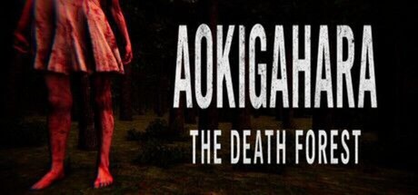
Aokifahara : The Death Forest is a psychological horror game set in a cursed forest where hallucinations blur reality. Solve puzzles, survive terrifying visions, and uncover the truth behind the legend—before you lose your
Free to PlayMixed(19)
AdventureAction3D
DVGamixJul 30, 2025