Scoring genre clarity...

TIME ARENA capsule

TIME ARENA

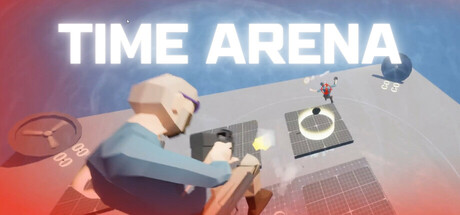
Get ready for a fast-paced multiplayer TPS shooter, where speed is your weapon and time is your battlefield! Collect objectives before the clock runs out, unleash time-bending power-ups, and outplay your friends. Challenge your friends and dive into the chaos. Time waits for no one!

$2.99
ActionStrategy3D Fighter
PINAXXOLADAApr 3, 2025

TIME ARENA scores 67/100 — better than 13% of Action capsules (n=8,535).

$2.99 · Released Apr 3, 2025 · By PINAXXOLADA

Quick text summary

TIME ARENA scored 67/100 on Steam Analyzer — Solid for a Action capsule. Top priority fix: [genre_clarity] Introduce faster, more aggressive visual language—dynamic pose, action blur, or particle effects—to signal multiplayer shooter identity over casual styling

Capsule scores by dimension

  • Genre Clarity: 7/10 — TPS mechanics visible but casual tone dominates. The isometric 3D environment with a character model and objective markers (clock, grid floor) suggests a multiplayer game with clear objective-based gameplay. However, at TINY size the cartoony art style and low-threat visual tone obscure the TPS/action positioning—it reads more like a casual party game than a competitive shooter. The time element is implied through the title but not visually reinforced in the scene itself.
  • Title Readability: 9/10 — Bold, clean, highly legible title. The 'TIME ARENA' text is rendered in large, bright white sans-serif with no decorative elements, positioned on the upper left against a clear background region. It maintains full readability at both SMALL and TINY sizes, with strong contrast against the gradient. The letterforms are crisp and spacing is professional.
  • Contrast & Color: 7/10 — Warm-cool gradient provides separation. The red-to-blue gradient background creates distinct value separation, with the light-toned character and objects standing out from the mid-tone background. At SMALL size the silhouettes remain clear. However, in grayscale the contrast is moderate rather than striking, and the midground elements blend slightly with the background gradient, reducing punch at TINY size.
  • Uniqueness & Polish: 6/10 — Competent 3D render, generic casual styling. The isometric scene uses clean 3D modeling and professional lighting, but the composition and visual language feel typical of casual multiplayer games rather than distinctive. The chunky character proportions and pastel-leaning color treatment lack the premium edge of top-tier action titles. The time mechanics are implied through title only, not through striking visual language or memorable art hooks.
  • Brand Consistency: 5/10 — Generic casual aesthetic, no iconic identity. The art direction shows consistent rendering and a coherent pastel-tinged 3D style, but lacks memorable visual identity—no signature character, symbol, palette, or motif that would be recognizable across other marketing materials. The scene could apply to dozens of casual multiplayer games without modification. Internal cohesion is present but brand differentiation is absent.
  • Composition: 6/10 — Centered focal point, adequate hierarchy. The character model in the center-left mid-ground serves as the primary focal point, with secondary elements (clock, grid, objectives) supporting around it. The layout is balanced and avoids clutter. However, the composition feels static and lacks depth layering—background, mid, and foreground elements lack clear dimensional separation. At TINY size the scene reads as a flat arrangement rather than a compelling action moment.

What works

  • Excellent title legibility. Large, bold white sans-serif type on controlled background ensures the game name reads perfectly at all sizes from full header down to tiny thumbnail.
  • Professional 3D rendering. Clean character model, consistent lighting, and well-crafted geometry demonstrate solid production quality and cohesive visual treatment.
  • Clear objective communication. The presence of markers, clock, and grid floor immediately signals objective-based gameplay to viewers.

What hurts the capsule

  • Weak genre positioning for action. Cartoony, pastel art style undermines the TPS/action positioning and reads closer to casual party game than competitive shooter.
  • No memorable brand identity. Generic casual aesthetic with no signature character, color palette, or visual motif that distinguishes TIME ARENA from dozens of similar titles.
  • Limited depth layering. Flat compositional arrangement lacks clear foreground-midground-background separation, reducing visual impact and perceived complexity at small sizes.
  • Time mechanic not visually reinforced. Despite the title emphasizing time as a core mechanic, no visual element powerfully communicates urgency or time-bending gameplay in the scene.

Priority fixes

  1. [genre_clarity] Introduce faster, more aggressive visual language—dynamic pose, action blur, or particle effects—to signal multiplayer shooter identity over casual styling
  2. [uniqueness_polish] Design a signature character, color palette, or recurring visual motif (e.g., a time-crystal, unique UI style, or bold accent color) that becomes recognizable across marketing
  3. [composition] Add layered depth cues such as depth-of-field, stronger background-to-foreground value separation, or dynamic action staging to increase visual hierarchy and energy
  4. [contrast_color] Boost silhouette clarity by increasing the value gap between character/objects and background, ensuring silhouettes read clearly in grayscale at TINY size

Store copy priority fixes

  1. [uniqueness] Add a sentence that explicitly differentiates the time-slowing Plasma Grenade mechanic—for example: 'Unlike traditional shooters, freezing enemies through time-slowing grenades is your primary crowd-control tool, forcing strategic plays over reflexes alone.' This positions time as a core tactical pillar, not just flavor.
  2. [feature_communication] Restructure the detailed description to open with a 'Core Mechanics' bullet list: Clock Collection, Speed Dash, Plasma Grenades, Environmental Hazards—then expand on each. This improves 30-second skim comprehension.
  3. [audience_targeting] Add explicit language about match scale and playstyle: 'Perfect for quick 4-player sessions with friends' or 'Best enjoyed in coordinated squads' to clarify whether this suits casual solo players or friend groups.

Related guides

Steam app ID: 3581130 · Tags: Action, Strategy, 3D Fighter, Shooter, Third-Person Shooter