Where the forest ends scores 70/100 — better than 34% of Gore capsules (n=827).

Quick text summary

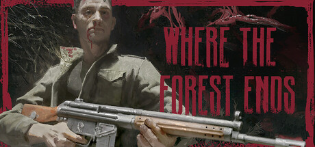
Where the forest ends scored 70/100 on Steam Analyzer — Good for a Gore capsule. Top priority fix: [uniqueness_polish] Introduce a distinctive visual element—either an iconic weapon detail, character silhouette, or thematic symbol (forest motif, decay effect, etc.) that creates unique brand recall compared to reference titles

Capsule scores by dimension

  • Genre Clarity: 7/10 — Post-apocalyptic shooter clearly read. The character holding a rifle, worn military clothing, and desolate industrial setting immediately communicate action-shooter gameplay in a survival context. At tiny size, the rifle silhouette and character pose remain recognizable as a shooter protagonist, though the specific zombie/horror angle is less obvious without color emphasis. The aesthetic aligns with post-apocalyptic adventure rather than pure horror.
  • Title Readability: 8/10 — Bold red title stands out well. The all-caps red title 'WHERE THE FOREST ENDS' uses strong value contrast against the dark background and maintains legibility at small sizes due to its size and letter spacing. At tiny size the text remains readable as a cohesive block, though individual letters lose some clarity. The placement in the upper right avoids the character entirely, preventing overlap or masking.
  • Contrast & Color: 8/10 — Strong warm-cool separation works. The cool desaturated character and background provide solid foundation, while the warm red title pops against the #1b2838 dark background with excellent value separation. The rifle's metallic tone adds mid-tone interest. In grayscale mental test, the silhouette reads clearly with good edge definition, though the character's muted palette risks blending slightly into the black background at tiny sizes.
  • Uniqueness & Polish: 6/10 — Competent but familiar aesthetic. The composition uses professional photography with a character holding a weapon against industrial decay, a common trope in post-apocalyptic games seen across the reference list. The desaturation and red accent create visual hierarchy, but the overall approach feels safe and template-like rather than distinctive. While technically clean, it lacks a memorable hook or unique art direction that separates it from similar survival shooters.
  • Brand Consistency: 6/10 — Muted palette lacks memorable identity. The desaturated color scheme with red accent is functional but generic to the survival-shooter genre, offering no distinctive character, icon, or signature visual motif recognizable across marketing. The industrial environment and soldier archetype are expected but interchangeable with many competing titles. Without access to the 10 screenshots, internal cohesion appears consistent but not distinctive enough to build brand recall.
  • Composition: 7/10 — Clear focal point, good space usage. The character positioned on the left two-thirds creates a strong primary focal point with the rifle as secondary emphasis, while the title anchors the upper right without competing for attention. At tiny size, the composition remains legible with the figure clearly readable as the subject. Safe margins are respected and the diagonal body orientation provides natural flow, though the character sits slightly edge-hugging on the left which could risk cropping on some Steam displays.

What works

  • Red title contrast. The all-caps red text delivers excellent pop against the dark background and remains readable at small sizes due to strategic placement and color choice.
  • Clear character focal point. The protagonist silhouette with rifle is unambiguous and immediately communicates the action-shooter genre across all viewing sizes.
  • Balanced composition. Title and character placement avoid overlap, creating visual hierarchy that reads cleanly from full size down to tiny thumbnail.

What hurts the capsule

  • Generic survival aesthetic. The desaturated character against industrial decay repeats common design patterns seen across the reference list without distinctive visual differentiation.
  • Muted color palette lacks identity. The cool desaturated tones provide professional execution but offer no memorable brand signature or recognizable visual motif for repeat players.
  • Character bleeds into background. The character's muted mid-tones risk subtle blending with the dark background, especially at tiny sizes where silhouette clarity is most critical.

Priority fixes

  1. [uniqueness_polish] Introduce a distinctive visual element—either an iconic weapon detail, character silhouette, or thematic symbol (forest motif, decay effect, etc.) that creates unique brand recall compared to reference titles
  2. [contrast_color] Add rim lighting or a secondary light source to separate the character from the background, ensuring strong silhouette definition at tiny sizes
  3. [brand_consistency] Establish a signature color accent or visual motif (beyond red text) that could appear consistently across store screenshots and marketing materials

Store copy priority fixes

  1. [uniqueness] Replace 'A fresh take on a classic genre' with a specific differentiator, such as 'Blend tactical combat with faction warfare—pit organized bandits against mindless hordes to survive,' or highlight the dynamic status effect system as a core innovation.
  2. [hook_strength] Expand the opening of the detailed description from two sentences to a 3-4 sentence hook that establishes the world's danger and story stakes before the features list, e.g., 'Your brother's offer of a simple scavenging run has pulled you into a decaying world where every shadow hides teeth. Between organized bandits and relentless undead, survival means choice—and every weapon, every tactic, every decision matters.'
  3. [audience_targeting] Add a difficulty or playstyle signal to clarify whether this is for tactical players, story-first players, or hardcore action fans, e.g., 'Perfect for players who love methodical, skill-based combat and morally complex storytelling' or 'Built for those who thrive under pressure.'

Related guides

Steam app ID: 3583670 · Tags: Gore, Violent, Action, Dark, Shooter