Scoring genre clarity...
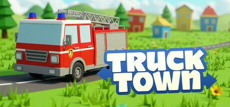
🚛 Truck Town: Kids and Toddlers Driving Game is a fun and easy driving game designed for young kids (ages 3-5). Drive a friendly truck around a colorful city, learn to use a controller or keyboard, and explore interactive areas that teach numbers, colors, and more in a playful way!
$9.596 user reviews
CasualRacingSimulation
Crater StudiosJun 19, 2025