Scoring genre clarity...
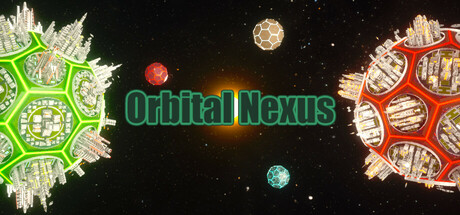
Start on a barren planet, expand your empire through resource management, fleet building, and planetary conquest. Discover cosmic relics, trade or fight with neutral factions, and build galactic wonders like particle colliders. Balance strategy, exploration, and combat to dominate the galaxy!
$11.99No user reviews
StrategySci-fiCity Builder
ZxStudioMar 30, 2025