Scoring genre clarity...

Word Play capsule

Word Play

Spell words, pick perks, score points, and survive until the end. Every round is different. How far can you make it?

$4.79Very Positive(15)
CasualWord GameSpelling
Game Maker's ToolkitJul 14, 2025

Word Play scores 87/100 — better than 98% of Casual capsules (n=10,392).

Very Positive (15 reviews) · $4.79 · Released Jul 14, 2025 · By Game Maker's Toolkit

Quick text summary

Word Play scored 87/100 on Steam Analyzer — Excellent for a Casual capsule. Top priority fix: [uniqueness_polish] Consider adding a subtle character element or perk card preview in the background to hint at the progression/survival mechanics mentioned in the description and differentiate from standard word games

Capsule scores by dimension

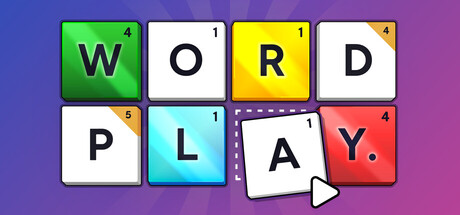
  • Genre Clarity: 9/10 — Clear word puzzle casual game. The large colorful letter tiles spelling 'WORD PLAY' with numerical point values instantly communicate a word-building puzzle game. The Scrabble-like aesthetic with point numbers on tiles is genre-specific iconography that reads perfectly at tiny size, leaving no ambiguity about the casual puzzle mechanics.
  • Title Readability: 9/10 — Excellent legibility across all sizes. The game title is spelled out literally as letter tiles in high contrast: green W, white O, yellow R, white D, white P, cyan L, white A, red Y. Each letter tile maintains crisp black outlines and bold letterforms that remain distinctly readable even at tiny thumbnail size, with the title occupying center-left prime real estate.
  • Contrast & Color: 9/10 — Strong color pop on dark background. The palette of bright lime green, cyan, yellow, red, and white tiles create excellent value separation against the purple-blue gradient background. The neon-like saturation and high contrast between tile colors and the dark background ensure silhouettes remain crisp even when squinting, with each letter tile clearly defined at any scale.
  • Uniqueness & Polish: 8/10 — Polished, distinctive casual aesthetic. The design showcases intentional craft with clean tile bevels, consistent drop shadows, numbered point values, and a cohesive Scrabble-inspired visual language that feels premium and purpose-built. While word games are familiar, the execution is distinctly polished and the visual hook (interactive letter tiles with scores) immediately communicates the core mechanic without feeling generic.
  • Brand Consistency: 8/10 — Strong identity with memorable motif. The colorful letter tile motif with numbered point values is a distinctive brand signature that could become iconic and recognizable across marketing materials. The consistent rendering style, rounded tile corners, point number placement, and color choices suggest a cohesive art direction that would carry through the 11 store screenshots and reinforce brand identity.
  • Composition: 9/10 — Excellent hierarchy and focal balance. The composition arranges letter tiles in an intuitive 2x2 grid with a cursor pointer at bottom-right, creating clear visual hierarchy with the title as primary focus and supporting UI elements providing context. The centered arrangement with balanced spacing uses prime real estate efficiently, and the design remains legible and balanced at small sizes without edge-hugging or awkward cropping issues.

What works

  • Iconic tile-based visual hook. The Scrabble-inspired letter tiles with point values instantly communicate both the genre and core mechanic, making it highly memorable and recognizable.
  • Flawless readability at all scales. Bold letterforms, high contrast, and clean outlines ensure the title remains crystal clear from full header size down to tiny thumbnail, with no legibility collapse.
  • Vibrant, cohesive color palette. The bright neon-like colors (lime, cyan, yellow, red) create excellent pop against the purple background while maintaining internal harmony and visual polish.
  • Smart spatial composition. The 2x2 grid arrangement with cursor element creates natural visual flow and guides attention efficiently without clutter or wasted space.

What hurts the capsule

  • Minimal differentiation in casual genre. While well-executed, the Scrabble-style tile aesthetic is familiar territory in word game marketing and may not immediately stand out from other casual puzzle titles at a glance.
  • No character or narrative hook. The capsule focuses entirely on the mechanics (letter tiles, points) without showing character, story, or personality elements that might create deeper emotional connection.

Priority fixes

  1. [uniqueness_polish] Consider adding a subtle character element or perk card preview in the background to hint at the progression/survival mechanics mentioned in the description and differentiate from standard word games
  2. [composition] Evaluate whether adding a subtle visual indication of the 'survive and score' stakes (like a health bar or round counter) would enhance storytelling without cluttering the clean current design

Store copy priority fixes

  1. [hook_strength] Rewrite the opening line to lead with the unique rule-changing mechanic: 'Spell words and unlock perks that fundamentally change the game—add tiles, multiply bonuses, create wildcards—then see how far you can survive.'
  2. [uniqueness] Add a concrete synergy example to the 'Synergies and Strategies' section, such as: 'For example: unlock the +2 Word Multiplier, combine it with a Golden Q tile, and suddenly a single word can be worth hundreds of points.'
  3. [audience_targeting] Add a sentence clarifying the roguelike loop: 'Lose all your Plays and restart from scratch, but keep your learned strategies and unlocked perks—each run gets you further.'
  4. [tone_match] Enhance the 'Relaxing' appeal by adding a brief sentence about pacing and low-pressure play: 'No timers, no stress—play at your own pace and take breaks whenever you like.'

Related guides

Steam app ID: 3586660 · Tags: Casual, Word Game, Spelling, Roguelike, Typing