Quick text summary
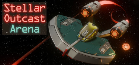
Stellar Outcast: Arena scored 73/100 on Steam Analyzer — Good for a Shoot 'Em Up capsule. Top priority fix: [uniqueness_polish] Introduce a visual hook unique to Stellar Outcast—iconic enemy type, signature upgrade effect, or distinctive arena environment detail—to differentiate from generic space shooters.
Capsule scores by dimension
- Genre Clarity: 8/10 — Clear arcade space shooter. The top-down spaceship with active engines, enemy fire trails, and explosion effects immediately communicate an action arcade shooter. At TINY size, the ship silhouette and orange/red weapon fire remain recognizable as combat-focused gameplay, though the specific 'arena' sub-context becomes less obvious without text.
- Title Readability: 7/10 — Readable with minor size issues. The three-line title uses neon red and cyan text with clean sans-serif letterforms that maintain legibility at SMALL size. At TINY size (120×45), the bottom line 'Arena' becomes cramped but still decipherable, while the stacked layout prevents collision with the central ship. The lack of outline or shadow on text is acceptable due to high contrast against the dark starfield background.
- Contrast & Color: 8/10 — Strong value separation and pop. Neon red title and orange/yellow engine glow create vibrant separation against the dark #1b2838 background and black starfield. The teal/cyan secondary text adds complementary contrast, and the warm engine trails provide clear luminous hierarchy. Grayscale test confirms the ship and title maintain strong value separation without muddy midtones.
- Uniqueness & Polish: 7/10 — Polished arcade aesthetic, modest originality. The capsule demonstrates clean 3D asset quality with well-lit ship geometry and professional particle effects suggesting arcade action. However, the top-down spaceship shooter visual is familiar in indie action games, and the composition lacks a distinctive hook beyond solid execution—no iconic character, unique mechanic visual, or memorable art direction that differentiates it from other space shooters.
- Brand Consistency: 6/10 — Coherent but not memorable. The capsule maintains internal consistency with a unified sci-fi aesthetic, matching the arcade action theme and the 'Stellar Outcast' branding through neon typography and space setting. Without access to comparing multiple store screenshots, the visual identity appears functional but lacks a distinctive motif or signature palette element that would make it instantly recognizable as uniquely 'Stellar Outcast' versus other arena shooters.
- Composition: 8/10 — Well-balanced focal hierarchy. The ship is positioned in the center-right with clear visual dominance, while the title occupies safe left margin space above the ship, preventing overlap and collision. The background starfield and explosion effects provide depth and context without overwhelming the primary subject. At TINY size, the composition remains readable with the ship clearly centered and title preserved in the upper left quadrant.
What works
- Strong neon contrast and glow. Red and cyan text pop cleanly against dark background; orange engine effects reinforce the arcade action aesthetic with visual warmth.
- Clear genre communication. Top-down spaceship with active combat effects immediately signals arcade action shooter without ambiguity.
- Balanced composition and safe spacing. Title placement in upper left avoids overlap with central ship; no wasted prime real estate or awkward empty gaps.
What hurts the capsule
- Generic space shooter visual. While polished, the top-down ship and particle effects are familiar arcade tropes with no distinctive visual hook or memorable identity cue.
- Limited brand differentiation. The sci-fi neon aesthetic is common across indie space games; no signature motif, character, or palette element distinguishes 'Stellar Outcast' Arena specifically.
- Bottom text cramping at tiny size. 'Arena' line becomes tight and less legible at 120×45px, though still readable due to high contrast.
Priority fixes
- [uniqueness_polish] Introduce a visual hook unique to Stellar Outcast—iconic enemy type, signature upgrade effect, or distinctive arena environment detail—to differentiate from generic space shooters.
- [brand_consistency] Add a recognizable visual motif (symbol, color accent, or UI element) that appears consistently across all marketing materials to build memorable brand identity.
- [title_readability] Increase top-to-bottom padding and consider a subtle glow or outline on 'Arena' to improve legibility at TINY size without losing neon aesthetic.
Store copy priority fixes
- [uniqueness] Highlight what makes the black hole mechanic or energy system fundamentally different from standard arcade shooters—e.g., 'shifting black holes force constant repositioning, turning the arena itself into an enemy' rather than a passive detail.
- [hook_strength] Replace 'ultimate space fighter' with a concrete, player-benefit outcome—e.g., 'Dodge, boost, and blast through relentless enemy waves. Master energy management to unlock devastating high-risk combos that turn the tide of battle.'
- [audience_targeting] Add a sentence signaling difficulty or play style fit—e.g., 'Perfect for arcade enthusiasts seeking skill-based reflex challenges' or 'Casual-friendly but skill-rewarding gameplay for players of all levels.'
- [feature_communication] Expand or clarify the high score mechanic's integration with the upgrade loop—e.g., explain if high scores unlock cosmetics, bragging rights, or gameplay bonuses, since this is often a tiebreaker for arcade players.
Related guides
Steam app ID: 3587620 · Tags: Shoot 'Em Up, Action, Top-Down Shooter, Flight, PvE