Scoring genre clarity...

Space Restaurant capsule

Space Restaurant

Space Restaurant is a simulation game that allows you to play solo or with up to 8 players in co-op and manage your own restaurant in space! Set up automation systems, customize your restaurant, and manage resources.

Early AccessSimulationMultiplayer
Syncodech GamesComing soon

Space Restaurant scores 73/100 — better than 54% of Early Access capsules (n=3,143).

Released Coming soon · By Syncodech Games

Quick text summary

Space Restaurant scored 73/100 on Steam Analyzer — Good for a Early Access capsule. Top priority fix: [uniqueness_polish] Introduce a visual gameplay hook—show a robot actively cooking, plating food, or interacting with a restaurant element to communicate the simulation core mechanic and differentiate from generic space scenes.

Capsule scores by dimension

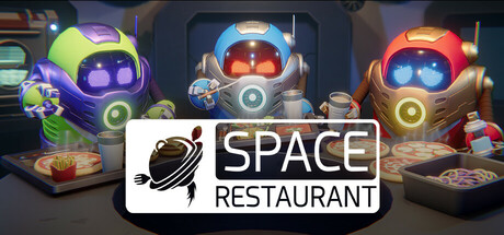
  • Genre Clarity: 8/10 — Space theme clearly established. Three colorful robotic characters in space suits with glowing visors and mechanical details immediately signal a sci-fi setting, while the restaurant context emerges from the logo and composed scene. At TINY size, the robot silhouettes and bright neon colors read as futuristic gameplay, though the specific simulation/management angle is less obvious without the text overlay.
  • Title Readability: 8/10 — Clear logo with solid contrast. The 'SPACE RESTAURANT' text sits on a clean white banner at bottom center with strong black letterforms and a distinctive planet icon to the left. The logo remains legible at SMALL size and maintains structure at TINY, though fine serif details on the text soften slightly at smallest viewing.
  • Contrast & Color: 8/10 — Vibrant subjects pop against dark space. The three robots display distinct neon colors—lime green, cool blue, and orange-red—each with bright glowing accents that separate them clearly from the dark purple-gray background. The white banner footer provides additional contrast relief, and the color palette maintains strong silhouette definition even in grayscale due to value spread.
  • Uniqueness & Polish: 7/10 — Polished 3D render, competent execution. The render quality is professional with clean lighting and mechanical detail work on the robot designs, suggesting a premium indie production. However, the scene reads as a generic 'cute robots in space' composition without a unique gameplay or narrative hook visible—similar visual language appears in many sci-fi management sims, so it lacks a distinctive visual identity.
  • Brand Consistency: 6/10 — Coherent robot aesthetic, weak identity. The three robots share consistent design language with matching proportions, gear accents, and visor styling that suggests internal art direction. However, there are no iconic signature motifs, memorable color scheme hierarchy, or character branding that would distinguish Space Restaurant from other robot-themed games on future recognition alone.
  • Composition: 7/10 — Balanced trio with anchored branding. Three robots arranged in a stable triangle formation at the top two-thirds of the frame create good focal distribution, while the white logo banner grounds the composition at the bottom with adequate clear space. The layout reads well at SMALL size with no critical elements at dangerous edges, though the center feels slightly empty between the robot group and logo, wasting some compositional tension.

What works

  • Strong color separation and silhouettes. Each robot's distinct neon hue (lime, blue, orange) and bright glowing details create excellent contrast against the dark background, ensuring clarity at TINY thumbnail size.
  • Professional 3D asset quality. The robot models, lighting, and material rendering show competent craft with clean mechanical detailing that communicates premium production values.
  • Clear, legible logo placement. The white banner with black text and planet icon anchor the design at bottom center with strong contrast and stable hierarchy at all viewing sizes.

What hurts the capsule

  • Generic sci-fi composition with no narrative hook. The three robots standing neutrally do not communicate a specific gameplay mechanic, tone, or unique selling point—a restaurant management angle is only readable via text, not visuals.
  • No memorable brand or character identity. The robot designs lack distinctive color schemes, iconic silhouettes, or thematic motifs that would make the game visually recognizable in future capsules or among similar titles.
  • Compositional void in center field. The space between the robot group and the logo banner creates an awkward empty gap that reduces visual engagement and wastes potential storytelling real estate.

Priority fixes

  1. [uniqueness_polish] Introduce a visual gameplay hook—show a robot actively cooking, plating food, or interacting with a restaurant element to communicate the simulation core mechanic and differentiate from generic space scenes.
  2. [brand_consistency] Develop a signature color or iconic robot design element that appears consistently across marketing to build immediate visual recognition among management sim audiences.
  3. [composition] Add environmental detail (restaurant counter, food items, or space station window) between the robots and logo to reduce compositional voids and strengthen the space-restaurant fusion concept.

Related guides

Steam app ID: 3587830 · Tags: Early Access, Simulation, Multiplayer, Casual, Automation