Scoring genre clarity...
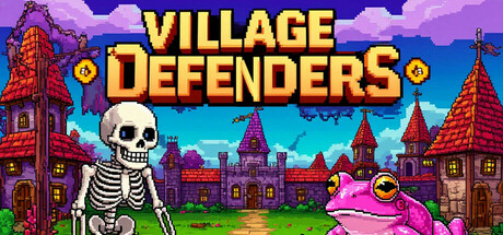
Village Defenders – A thrilling pixel art 2D roguelike game where you strategize to protect your village from relentless waves of undead. Gain experience, unlock powerful abilities, and defend your home from monstrous invaders! Can you hold the line and save the village?
$2.99Mostly Negative(16)
IdlerRogueliteZombies
Uberbax-GamingAug 6, 2025