Scoring genre clarity...
OKU capsule

OKU

Without art, our world is fading. As the lone apprentice to a vanished haiku master, you venture out into Japanese landscapes and capture their beauty in poetry to restore forgotten paths. Explore your legacy, meet other travelers on this meditative journey, and learn to appreciate art and nature.

Word GameHand-drawnExploration
Irox GamesTo be announced

OKU scores 77/100 — better than 67% of Relaxing capsules (n=3,959).

Released To be announced · By Irox Games

Quick text summary

OKU scored 77/100 on Steam Analyzer — Good for a Relaxing capsule. Top priority fix: [genre_clarity] Add a subtle visual cue such as a floating haiku scroll, wind particles, or monk robes detail to hint at the poetry and spiritual mechanics without cluttering the landscape.

Capsule scores by dimension

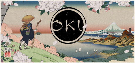
  • Genre Clarity: 8/10 — Clear artistic adventure vibe. The serene Japanese landscape, traveling figure, mountain silhouette, and contemplative color palette immediately signal a meditative adventure game. The artistic hand-painted style and peaceful composition strongly suggest narrative-driven indie adventure over action or puzzle genres. At tiny size, the mountainous landscape and lone traveler still read as a journey-focused experience, though specific mechanics like poetry writing are not visually apparent.
  • Title Readability: 7/10 — Readable logo, minimal approach. The 'OKU' logo sits in a clean circular frame at the top center with clear black letterforms on negative space. The logo maintains legibility at small and tiny sizes due to its simple geometric design and high contrast against the light background. However, the minimal three-letter title offers no additional context or tagline to reinforce brand recognition at glance.
  • Contrast & Color: 8/10 — Excellent value separation. The image uses a warm cream-to-blue gradient background that creates strong tonal separation from the darker landscape elements, figures, and the bold circular logo. Pink flowering trees, blue mountain, and earth-tone structures all maintain clear silhouettes against the soft sky. At tiny size, the composition remains visually distinct with no muddy blending; the grayscale test shows excellent value range from light sky to dark foreground shapes.
  • Uniqueness & Polish: 8/10 — Distinctive hand-painted aesthetic. The watercolor-like illustration style, soft color harmonies, and peaceful Japanese-inspired setting differentiate this from typical adventure capsules. The composition tells a clear story of contemplative travel rather than generic action or mystery. The hand-crafted feel and deliberate color choices communicate a premium indie vision with artistic intention.
  • Brand Consistency: 7/10 — Cohesive art direction, limited iconic elements. The entire capsule maintains a consistent soft, muted palette dominated by earth tones, pinks, and cool blues with a unified hand-painted rendering style. The minimalist circular logo with 'OKU' is recognizable but the capsule lacks a signature character, symbol, or motif that would immediately identify future promotional material as part of this brand. The serene aesthetic is internally coherent but not distinctly memorable as a standalone identity marker.
  • Composition: 8/10 — Strong hierarchy, balanced landscape. The logo anchors the top center, the mountainous landscape dominates the middle depth layers with clear foreground, midground, and background separation, and the figures are positioned naturally within the scene without competing with the primary focal point. The composition uses asymmetrical balance effectively, with the pink flowering tree on the left and structures on the right guiding the eye through a natural scenic journey. At small and tiny sizes, the landscape remains the clear primary subject while the logo stays legible and centered.

What works

  • Serene artistic direction. The soft watercolor palette and Japanese-inspired landscape immediately communicate the meditative, spiritual theme of the game.
  • Strong silhouettes and depth. Layered landscape with clear foreground, midground, and background elements creates visual interest and readable composition at all sizes.
  • Excellent contrast against dark background. The cream-to-blue gradient and distinct color zones maintain clarity and pop against Steam's dark UI even at thumbnail size.
  • Clean, minimal logo design. The circular framed 'OKU' logo remains legible and distinctive at small sizes due to its simple geometric structure.

What hurts the capsule

  • Limited brand-specific iconography. The capsule uses generic landscape elements rather than character or symbol-based branding that could be recognized independently.
  • No gameplay clarity. The visual language communicates mood and setting but does not visually hint at the core haiku-writing or wind-riding mechanics.
  • Minimal contextual framing. There is no tagline, subtitle, or additional text to help first-time viewers understand what the game is beyond 'a beautiful journey game.'

Priority fixes

  1. [genre_clarity] Add a subtle visual cue such as a floating haiku scroll, wind particles, or monk robes detail to hint at the poetry and spiritual mechanics without cluttering the landscape.
  2. [brand_consistency] Introduce a signature character, animal companion, or symbol (e.g., a stylized crane, wind motif) that can serve as a recognizable identity marker across future promotional materials.
  3. [title_readability] Consider adding a minimal tagline like 'A Journey of Poetry' below or near the logo to reinforce narrative purpose at small sizes.

Store copy priority fixes

  1. [hook_strength] Rewrite the short description to be distinct from the opening paragraph—lead with the specific combination of poetry-writing and wind-traversal that no other game offers, e.g., 'Write haiku poems to traverse a living Japanese landscape, unlocking forgotten places with each verse you craft.'
  2. [feature_communication] Add a sentence clarifying the difficulty and failure states of movement challenges, and whether they are mandatory or optional, to set realistic expectations for casual/relaxing players.
  3. [uniqueness] Strengthen the asynchronous poetry-sharing mechanic in the short description or opening, as this is the most differentiating feature and currently feels buried in the middle of the detailed copy.
  4. [genre_clarity] Add a single line stating approximate playtime or scope (e.g., '8–12 hours,' 'dozens of scenic areas') to help players evaluate the game's scale and value proposition.

Related guides

Steam app ID: 3590650 · Tags: Relaxing, Adventure, Atmospheric, Stylized, Exploration