Scoring genre clarity...

Space Rocks in Space capsule

Space Rocks in Space

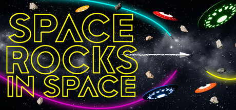
Blast into the chaos of Space Rocks in Space, the ultimate 3D space flight adventure. Pilot customizable ships, explore stunning worlds, and battle through asteroid storms, UFO attacks and endless missiles barrages in this retro arcade odyssey.

$5.99
ArcadeCasualFlight
Rock HyraxApr 16, 2025

Space Rocks in Space scores 78/100 — better than 78% of Arcade capsules (n=3,765).

$5.99 · Released Apr 16, 2025 · By Rock Hyrax

Quick text summary

Space Rocks in Space scored 78/100 on Steam Analyzer — Good for a Arcade capsule. Top priority fix: [brand_consistency] Introduce a distinctive ship design, logo symbol, or visual motif that appears consistently across capsule and screenshots to build instant brand recognition.

Capsule scores by dimension

  • Genre Clarity: 8/10 — Strong arcade space shooter signal. The capsule clearly communicates a retro arcade space game through recognizable elements: colorful geometric ships, asteroid rocks, glowing energy trails in cyan and magenta, and a dark starfield background. At TINY size, the bright neon yellow title and colorful projectiles/ships immediately read as an action space game, though the exact subgenre (3D flight vs. top-down shooter) is slightly ambiguous without text.
  • Title Readability: 9/10 — Excellent neon yellow legibility. The title 'SPACE ROCKS IN SPACE' uses bold, outlined neon yellow letterforms with clean geometric sans-serif styling that maintains full readability at FULL, SMALL, and TINY sizes. The title placement in the upper-left quadrant sits on dark background with no competing texture, and the outline weight ensures crisp edges even at thumbnail scale. Letter spacing is generous and consistent, allowing each word to separate clearly during quick scrolls.
  • Contrast & Color: 9/10 — Vibrant neon pops against dark void. The bright neon yellow title, cyan energy rings, magenta curved trails, and orange/red projectiles create strong value separation against the near-black (#1b2838 equivalent) starfield. The silhouettes of ships and asteroids remain distinct in grayscale due to light gray and white highlights, and the saturated accent colors ensure the design reads as premium and energetic even at TINY size. No muddy mid-tones or blended elements compromise readability.
  • Uniqueness & Polish: 7/10 — Polished retro aesthetic, modest originality. The design demonstrates solid craft with clean neon typography, intentional color choices (yellow, cyan, magenta), and a cohesive retro arcade-to-3D fusion vibe. However, the visual concept—geometric ships, asteroids, and neon trails—draws heavily from familiar arcade game tropes and lacks a distinctive mechanical or narrative hook that signals what makes this game unique beyond 'space action with asteroids.' The execution is competent but the core idea reads as a well-executed genre homage rather than a standout premise.
  • Brand Consistency: 6/10 — Functional retro style, no icon signature. The capsule establishes a coherent retro neon aesthetic with consistent cyan, magenta, and yellow color palette and geometric ship silhouettes that could be tied to franchise identity. However, without access to the 9 store screenshots, no distinctive character, logo motif, or signature visual element is evident that would make this capsule immediately recognizable as 'Space Rocks in Space' vs. a generic arcade space game. The style is internally consistent but not memorable or iconic.
  • Composition: 8/10 — Strong focal hierarchy, clean layout. The title dominates the upper-left quadrant as the primary focal point, with secondary visual interest (ships, trails, asteroids, rings) distributed across the center and right side without competing for attention at SMALL or TINY sizes. The composition uses depth layering—dark background, mid-tone asteroids and ships, bright neon accents—to create clear visual separation. Safe margins are respected; no key elements sit dangerously close to crop edges, and the design remains coherent across all size scales.

What works

  • Outstanding title contrast and legibility. Neon yellow outlined letterforms read perfectly at all sizes from full header to tiny thumbnail without any collapse or blur-related loss of clarity.
  • Vibrant color pop against Steam dark background. Saturated cyan, magenta, and orange accent colors create premium visual separation and high energy feel that stands out in store browsing.
  • Clear genre and action messaging. Asteroids, ships, trails, and projectiles immediately communicate arcade space action without needing to read text.
  • Balanced composition with no focal clutter. Title dominates upper region while ships and effects fill center/right without creating visual competition or scattered attention.

What hurts the capsule

  • Generic retro space game concept. The visual identity relies on familiar arcade tropes (asteroids, neon ships, trails) without a distinctive mechanical or narrative hook that differentiates this game.
  • No memorable brand icon or motif. Unlike genre-leading titles, there is no signature character, logo symbol, or unique visual pattern that would make this capsule instantly recognizable as 'Space Rocks in Space' on repeat viewing.
  • Limited storytelling or unique selling point. The capsule shows action but does not visually communicate what makes the 3D flight experience, customization, or world exploration distinctive from other space action games.

Priority fixes

  1. [brand_consistency] Introduce a distinctive ship design, logo symbol, or visual motif that appears consistently across capsule and screenshots to build instant brand recognition.
  2. [uniqueness_polish] Add a visual element that hints at the 3D flight or customization mechanic—such as a detailed ship cockpit, planet detail, or iconic enemy UFO—to differentiate from generic asteroid shooters.
  3. [genre_clarity] Consider subtle UI or HUD elements (targeting reticle, altitude gauge) to reinforce the 3D pilot experience and set this apart from top-down arcade games.

Store copy priority fixes

  1. [uniqueness] Add one sentence explaining what specific mechanic or feature distinguishes this from the original Asteroids or other space arcade games—e.g., 'Dynamic world-shifting that changes enemy patterns mid-stage' or 'Ship loadout system that changes how you approach each world.'
  2. [feature_communication] Replace 'The possibilities are infinite' with concrete examples of customization options—e.g., 'Choose from speed-focused scouts, tank-heavy gunships, or balanced all-rounder pilots, each with unique weapon loadouts.'
  3. [audience_targeting] Clarify difficulty and accessibility early in the detailed description if the game is truly casual/family-friendly—add a sentence like 'Master the basics in minutes, but challenge yourself with higher difficulty waves for hardcore score-chasers.'

Related guides

Steam app ID: 3591990 · Tags: Arcade, Casual, Flight, Space Sim, Vehicular Combat