Scoring genre clarity...
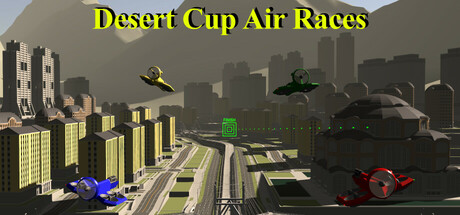
The races are held in four desert cities. Each race has a “track” composed of connected “waypoint gates”. The red race vehicle is under your control. When the vehicle flies through a waypoint gate, the next gate will appear. The goal is to finish three laps of the track as quickly as possible.
$1.99
RacingSimulationFlight
Steve WuApr 25, 2025