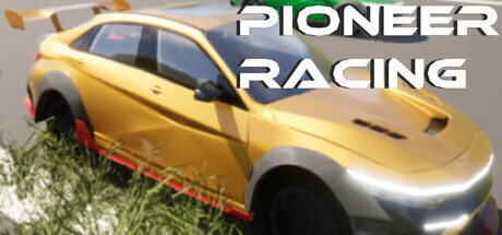
Pioneer Racing scores 67/100 — better than 10% of Combat Racing capsules (n=209).

Quick text summary

Pioneer Racing scored 67/100 on Steam Analyzer — Solid for a Combat Racing capsule. Top priority fix: [uniqueness_polish] Add a distinctive livery or logo to the car that ties to the 'Pioneer Racing' brand identity and becomes recognizable across marketing assets

Capsule scores by dimension

  • Genre Clarity: 8/10 — Clear racing game visual identity. The bright yellow performance car with aggressive stance, red racing stripe, and grass track setting immediately communicate a racing game. At tiny size, the car silhouette and track environment remain legible enough to clearly identify this as a racing title. The vehicle's sports car proportions and track context eliminate genre ambiguity.
  • Title Readability: 7/10 — Readable but tight spacing. The white sans-serif 'PIONEER RACING' text has good contrast against the mid-tone background and reads clearly at full size. At small size the letters remain distinct, though the spacing is slightly compressed and taglines become difficult to parse. At tiny size the title holds legibility due to the white-on-dark approach, though letter forms lose definition.
  • Contrast & Color: 7/10 — Strong yellow car pops cleanly. The bright golden-yellow car provides excellent value separation against the neutral gray-green background and Steam dark color. The white title reinforces contrast hierarchy. In grayscale, the car's mid-tone still reads as distinct from background, though the overall value range is somewhat compressed in the lower-mid tones of the track and grass.
  • Uniqueness & Polish: 6/10 — Competent but generic racing shot. The car render quality is clean and the angle shows the vehicle well, but the composition feels like a standard automotive showcase common across many racing games. There is no distinctive art direction, unique mechanic visualization, or memorable hook that differentiates this from comparable racing titles. The presentation is professional but lacks the visual storytelling or signature style of top-tier racing game marketing.
  • Brand Consistency: 5/10 — Minimal brand identity present. The capsule shows a generic high-performance car with no distinctive livery, logo placement, or visual motif that would be recognizable across marketing materials or in-game assets. Without reference to the 8 store screenshots, it is difficult to identify any cohesive internal brand language or memorable identity cue. The yellow color is the only potential recurring element, but it lacks supporting visual or typographic consistency.
  • Composition: 7/10 — Clear focal point with safe margins. The yellow car occupies the center-left primary zone with good depth layering: grass and track in foreground, car as midground subject, and blurred environment in background. Title placement in upper right uses safe margins and does not interfere with the vehicle. At small and tiny sizes, the car remains the clear focal point, though the blurred background clutter slightly reduces the crisp read.

What works

  • Strong car silhouette contrast. The bright yellow vehicle pops distinctly against neutral background tones and maintains legibility at all sizes down to tiny thumbnail.
  • Title clarity and placement. White sans-serif text in upper right avoids overlap with the car and leverages high contrast for readable performance at small sizes.
  • Clear racing genre signaling. The car angle, track setting, and grass environment immediately communicate a racing game without ambiguity.

What hurts the capsule

  • Generic automotive composition. The standard three-quarter car reveal shot lacks distinctive visual storytelling or unique mechanic visualization that differentiates it from competitors.
  • Weak brand identity markers. No recognizable livery, logo, or signature visual motif present to build brand consistency or recall beyond the yellow color.
  • Blurred background reduces clarity. The out-of-focus environment adds visual clutter at small sizes and dilutes focus on the primary subject without serving a clear compositional purpose.

Priority fixes

  1. [uniqueness_polish] Add a distinctive livery or logo to the car that ties to the 'Pioneer Racing' brand identity and becomes recognizable across marketing assets
  2. [brand_consistency] Establish a cohesive color palette and typographic treatment that echoes across all capsule variants and store screenshots
  3. [contrast_color] Sharpen the background focus or simplify it to reduce mid-tone clutter and increase the car's visual separation at tiny sizes
  4. [composition] Consider a dynamic racing action angle or multi-car scenario to differentiate from generic static car showcase common in the genre

Store copy priority fixes

  1. [hook_strength] Rewrite the short description opening to lead with a specific, verb-forward hook: 'Master 12 circuits and chase the perfect lap' or 'Turn a stock car into a competitive machine through skill and upgrades,' replacing the generic 'focused on performance and lap times.'
  2. [uniqueness] Add 1–2 sentences explaining what makes Pioneer Racing's progression or gameplay loop distinct—e.g., 'Unlike arcade racers, every performance tweak visibly impacts your times' or 'A solo developer's obsessive focus on lap-time realism and tuning depth.'
  3. [feature_communication] Expand the customization paragraph to show specific examples: 'Adjust suspension stiffness, brake bias, and tire pressure to find your optimal setup for each circuit condition,' so players understand the depth and relevance of the system.
  4. [audience_targeting] Add a sentence acknowledging the broader audience: 'Whether you're chasing milliseconds or enjoying relaxed free driving, Pioneer Racing adapts to your pace,' to soften the hardcore-only positioning and broaden appeal.

Related guides

Steam app ID: 3595220 · Tags: Combat Racing, Racing, Driving, PvE, Automobile Sim